If we have to name a thing that never goes out of style, it is dark kitchen cabinetry.
It is an element that you should never miss in your kitchen if you want to create a trendy and sophisticated look.
- Dark Kitchen Cabinets with Light Laminate Countertops Balanced by the Gray Backsplash
- Transitional Kitchen with Dark Stained Cabinets and White Carrara Marble Countertops
- Combination of Dark Flat Panel Cabinets, White Countertops, and Light Tone Wood Floor
- Alder Cabinets Espresso Stained in Dark Shade Paired with Light Granite Countertops in a Contemporary Kitchen
- Cherry Wood with Walnut Stain Cabinets and Light Typhoon Bordeaux Granite Countertops in a Slate Floor Kitchen
- Dark Chocolate Cabinetry and Light Cashmere White Countertops that Match the Backsplash
- Polished and Dark Kitchen Cabinets that Contrast the Light Calacatta Gold Marble Backsplash and Countertops
- Dark Kitchen Cabinets and Light Marble Countertops Accentuated with Blue Backsplash
- Two-toned Cabinetry in Dark and Blue Shade Combined with Light Bass Wood Countertops
- Dark Raised Panel Cabinets with Light Beige Granite Countertops that Match the Backsplash and Floor
- Cherry Wood Cabinets in Dark Clove Stain and Light Countertops Paired with White Subway Tile Backsplash
- Dark Tone Wood Kitchen Cabinets and Light Polished Countertops in a Mid-century Kitchen
- Combination of Light Countertops, Sea-green, and Silver Color Scheme Paired with Dark Wood Cabinets to Add Warmth
- Merging Old Look and Contemporary Design by Pairing Dark Cabinets with Light Countertops, Backsplash, and Reclaimed Wood Elements
- Extra Tips for Dark Kitchen Cabinets and Light Countertops
Dark kitchen cabinets will never fail to create a richer, deeper, and more “closed” space.
Compared to the white counterparts, dark cabinets don’t show signs of age sooner. Probably that’s one of the reasons why dark cabinets are popular.
However, keep in mind that dark cabinets, be it dark tone wood or dark stained products, can also make your kitchen dark. This will be a problem if you have a small space. The dark cabinets will cram your kitchen.
There are some solutions to brighten up your kitchen. One of them is by installing light countertops.
Light countertops will not only brighten up your dark kitchen but also create a contrast to your dark-stained cabinets.
Dramatic contrastwill deliver a modern or a contemporary look, especially if the cabinets are finished in polished or matte, and the countertops have a bit of veining pattern in them.
If you want to take a more detailed look, we’ve curated 15 modern dark kitchen cabinets with light countertops here to inspire you:
1. Dark Kitchen Cabinets with Light Laminate Countertops Balanced by the Gray Backsplash
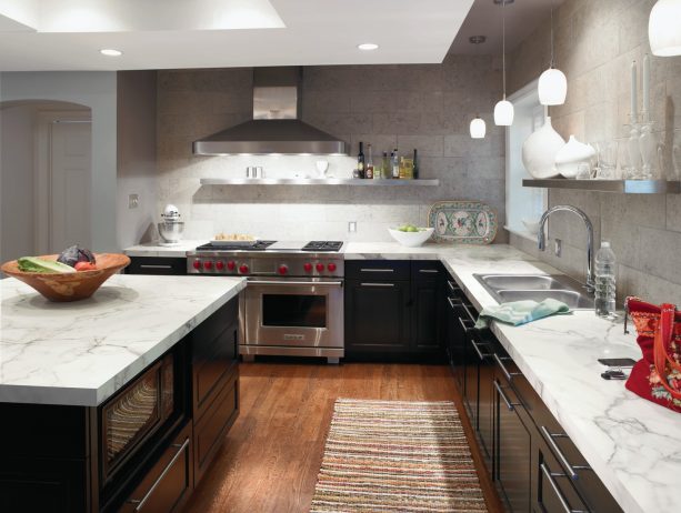
Gray backsplash is added here to enhance the modern look of this kitchen.
The cabinets, the countertops, and the backsplash are on the neutral side, and this is a good combination if you want to stick with a minimalist yet stylish look.
The gray backsplash looks more elevated with the metal open shelving. Those shelves are fabricated using Formica-brand DecoMetal laminate.
The kitchen cabinets look especially dark; the designer apparently stained them in an ebony shade. Combined with metal hardware, the dark cabinets look polished and put together.
To create a contrast, the countertops are carefully selected in light color, a laminate top that looks different from marble or granite, with 1 1/2” thickness.
So, is a laminate countertop an even better option?
FYI, laminate is an incredibly durable surfacing material. You can be sure that laminate can last for decades upon decades. Laminate has its own pros and cons compared to other materials, similar to others.
Granite, for instance, can deal with extreme heat and direct cutting, where laminate can’t. On the other hand, granite is porous and high maintenance. It can be pit if not cared for and sealed properly, while laminate is low maintenance.
2. Transitional Kitchen with Dark Stained Cabinets and White Carrara Marble Countertops
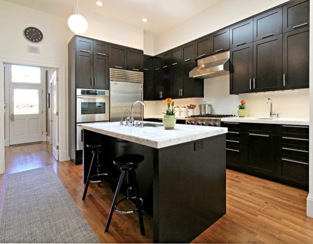
In order to design a transitional kitchen like this, you need to combine traditional and modern elements at the same time.
Here, the wood floor, which seems white oak stained, exudes an old-world charm perfectly. The vintage stools placed in the island area are also classic enough.
On the contrary, the simplicity and the black and white color scheme never fail to give you a modern appearance.
The kitchen cabinets look extra dark. It seems they were treated with a very dark stain, like Sherwin Williams – New Ebony. The Carrara marble countertops are light, a super white shade.
The extreme dark and light shade combination like this will increase the intensity of the contrast.
Moreover, the walls are also painted in crisp white along with the backsplash. The brightness of the white color in this kitchen is very strong. It managed to open up the whole area and make it look brighter even though it seems that this kitchen lacks windows.
The only accent in this black and white kitchen is the gray runner that seems at odds against the medium tone wood floor. This kitchen’s absence of bold color makes it look polished, neat, and clean.
3. Combination of Dark Flat Panel Cabinets, White Countertops, and Light Tone Wood Floor
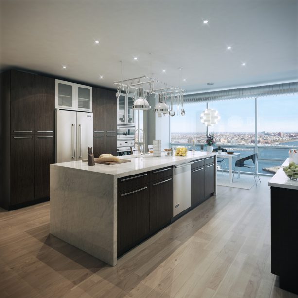
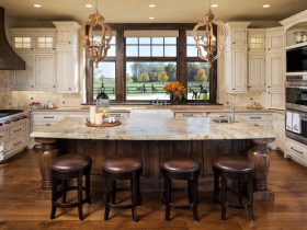
This kitchen features a window wall that opens to the breathtaking view around.
Due to the huge windows, installing dark-stained cabinetry is a safe option. The dark cabinets won’t make the kitchen look crammed and dark. Instead, the dark flat panel cabinets deliver a sophisticated look.
In a bright and spacious kitchen, dark cabinetry is a nice element to balance the entire look. It seems that the cabinets are made of plain sliced white oak and finished with a dark stain. What a stylish choice. Moreover, the metal hardware gives a modern appearance too.
The light countertops seem to be a Carrara marble. The waterfall edge gives a polished look. It complements the light tone wood floor, which is from Laurel Collection, Milano.
It is obvious that light countertops paired with a light tone wood floor will create cohesion, especially if you add sufficient artificial lighting and huge windows around.
The brightness in the kitchen delivers a warm ambiance that stands on a modern side. In this case, the dark cabinets are used as an accent only, an element that pops against the light-colored scheme.
4. Alder Cabinets Espresso Stained in Dark Shade Paired with Light Granite Countertops in a Contemporary Kitchen
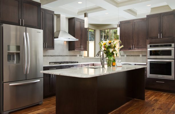
Basically, this kitchen is not as spacious and bright as the previous one. However, the designer still managed to make it look open despite the dark stained cabinetry.
This modern kitchen features alder cabinets stained in espresso color to achieve this dark tone. This is an Alder cabinetry from Canyon Creek Cabinets. The countertops are chosen in light colors made of granite to create a balancing look.
Light-colored countertops, white backsplash, and white coffered ceiling are more than enough to brighten up the room.
If you’re wondering, the backsplash is Emser Cosmopolitan 13×13 Crystal with 3×13 sbn and DECO Statements 10” cut field tile + 2” cut of HG Glass Murano Vena Mosaic, which is cut the field to the cabinet. It has TEC #949 Silverado grout.
Stainless steel appliances are added to complement the dark and light shades, along with icy looking pendants to illuminate the whole room. The Acacia natural hardwood floor unites all together.
We can see how this medium tone wood floor contrasts both the dark cabinets and the light countertops. It means that the floor stands on its own in this kitchen, serving as a canvas for the other elements. What a perfect option for a kitchen floor.
5. Cherry Wood with Walnut Stain Cabinets and Light Typhoon Bordeaux Granite Countertops in a Slate Floor Kitchen
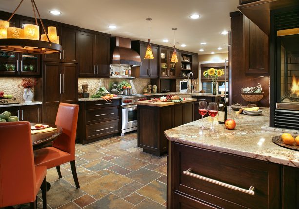
There’s something elegant in this mid-sized kitchen. Even though the cabinets almost fill every space, they don’t make the kitchen look crowded. It is because the designer managed to combine the color scheme perfectly, between dark and light shades.
The cabinets are made of cherry wood with a walnut stain, an elegant dark stain that will complement any large kitchen. According to the designer, the cabinets are from their private line of cabinetry, Mastro Rosolino.
When it comes to the countertops, the designer doesn’t specifically use white color. Instead, they chose a light granite countertop in Typhoon Bordeaux color, purchased at Stone Surfaces in East Rutherford, NJ.
This is basically a beige-colored countertop with gold veins. Choosing a countertop like this will not create a dramatic contrast to the cabinets. Instead, it will just complement the dark cabinets, enhancing the contemporary look.
To top it off, the designer installed a porcelain tile floor.
Many of you may not believe that this floor is actually not made of natural slate. Yet, this is a perfect porcelain tile that mimics slate flawlessly. It makes this kitchen looks as if it was completed with a travertine floor that ties all the look together.
6. Dark Chocolate Cabinetry and Light Cashmere White Countertops that Match the Backsplash
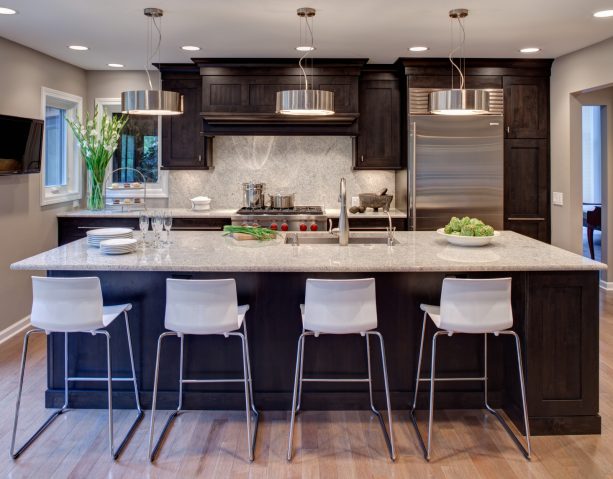
This small and contemporary kitchen features dark chocolate cabinetry and light Cashmere white granite countertops for contrast.
They are completed with a large island for prepping and entertaining, built-in Sub Zero refrigeration, stainless pendants, a Wold range top, and hardware that adds sparkle to the cabinets.
The cabinets are made of Alder, and they are stained in the shade called “Mystic”. Dark cabinets can serve as a canvas for any accent element you choose.
In this kitchen, the cabinetry is used as a background from the contemporary lights. Those lights are from Eurofase, 12530-045.
The light tone wood floor contrasts the dark cabinets perfectly too. This is pre-finished Canadian maple hardwood with a koala finish from Preverco.
The backsplash is also made of granite, similar to the countertops, to create cohesion. The full-height granite backsplash delivers a dramatic look. It is also functional and practical for easy cleaning.
To create a soft, bright, and light appearance, the wall is also painted in a similarly light color: Benjamin Moore – Thunder.
Basically, the light tone floor, backsplash, countertops, and walls are enough to brighten up this kitchen despite the fact that there are only small windows.
7. Polished and Dark Kitchen Cabinets that Contrast the Light Calacatta Gold Marble Backsplash and Countertops
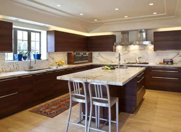
Unlike the previous dark cabinets, the cabinetry in this kitchen is finished in a natural stain.
So, instead of looking super dark, the cabinets show the glory of the natural wood grain. The tone is a bit red, reddish-brown, just like a typical wood. Those are from the cabinet company in Germany called Eggersmann.
In order to enhance the luxurious look, the designer creates a contrast to the polished dark tone kitchen cabinets.
The light countertops and the backsplash are made of a similar material, which is a unique Calcutta gold marble. The countertops are 2” thick, both on the perimeter and the island.
Matching countertops and backsplash is a great idea if you want to create a consistent look, especially with unique material and shade like this.
What makes the contrast between the cabinets and the countertops even more appealing is the fact that the designer installed under counter lights.
Those are low-profiled strip LED lights from a company called Luminii. They are routed into the underside of the upper cabinets. Along with the recessed ceiling lights, these lights provide enough warm yellow glow to create an inviting ambiance.
8. Dark Kitchen Cabinets and Light Marble Countertops Accentuated with Blue Backsplash
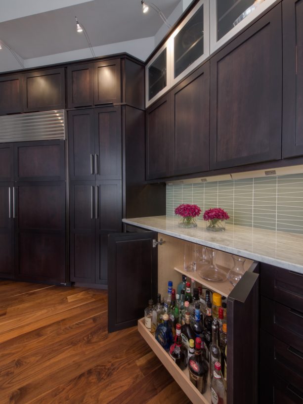
This is shaker cabinetry that offers a simple look.
These are alder wood from Custom Cupboards stained in a dark color. The stain lets the grain of the wood be highlighted, so this kitchen has more depth in the appearance of these cabinets.
The pulls are bronze finish from Top Knobs, the kind of pulls that you need if you want something simple yet striking.
The great thing about this cabinetry is that there is a stainless steel element added despite its sophisticated dark stain. The glass front doors are completed with stainless material in the upper cabinets.
Combining stainless and dark tones in cabinetry will always deliver a futuristic look. This is an excellent way to enhance a modern look in your kitchen.
On the other hand, the base cabinets are a standard 36” one completed with a pull-out shelf accessory that is used for a liquor shelf. It only takes one pull-out to access the bottle collections. This contemporary cabinetry indeed provides a lot of storage.
The light-colored Carrera marble is used for the countertops. It has gray veining, which adds more dimension to the cabinetry.
The designer doesn’t stop at the black and white combo to add a subtle accent. They go further by installing a soft blue backsplash that is made of glass tile. It is the waveline glass from Island Stone that looks nice combined with the white countertops.
9. Two-toned Cabinetry in Dark and Blue Shade Combined with Light Bass Wood Countertops
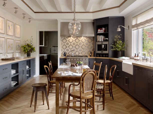
The cabinetry has two tones. Instead of black and white, the designer stained both the base cabinets in dark tone wood and blue.
The blue-gray cabinets are painted in Benjamin Moore – Midnight Blue. Both create a different look. The dark-tone cabinets deliver a more traditional look, while the blue-gray ones are more modern. These are custom cabinets with a shallow 1/8” shaker door.
Instead of an island cabinet, there is a wooden dining table placed in the center of the kitchen to enhance the traditional look. Yet, the globe pendants over it deliver a more modern look.
It shows that basically, every element in this kitchen has a balancing effect of modern and traditional. Hence, the transitional style.
However, both of them are completed with light bass wood countertops. The countertops appear lighter brown than white, but it turns out that they complement the dark tone and the blue gray cabinets flawlessly.
The light countertops make the kitchen look more stylish. Moreover, they blend seamlessly with the white walls painted in Benjamin Moore – White Dove and completed with Benjamin Moore – Simply White trim.
The most striking part of this kitchen is the backsplash. It is an inlaid metal backsplash from Tabarka, which gives an ultra-modern look to the entire area. The backsplash is similar to the floor, which is an Oak laid in a herringbone pattern.
Both add more character to this kitchen. They offer something different. You can always lean on them if you want to add a whimsical element to your kitchen.
10. Dark Raised Panel Cabinets with Light Beige Granite Countertops that Match the Backsplash and Floor
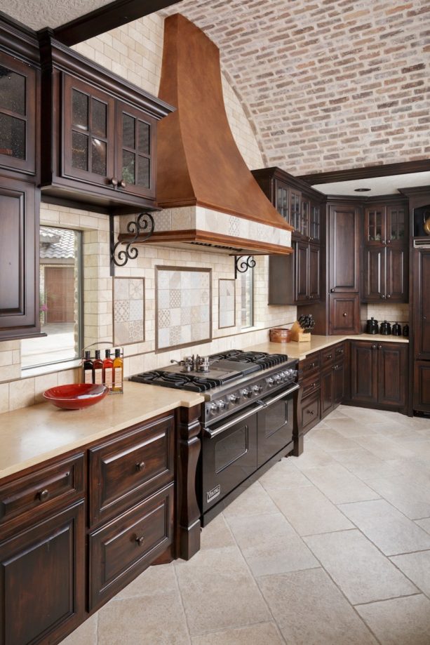
Despite its dark raised panel cabinets, every element in this kitchen exudes a perfect Mediterranean look, from the light beige color scheme to the arched design.
The raised panel cabinets are stained in a dark tone to counterbalance the lightness of the beige color.
The light beige countertops are made of granite that matches the backsplash, which is also in beige color but made of porcelain, completed with an accent tile. The tiles are in a broken joint pattern.
The black appliances somehow complement the cabinetry because they deliver a mysterious and elegant look to this open and bright kitchen. The cabinets are from RWS Cabinets.
The brick accent juxtaposes the porcelain tile backsplash and contrasts each other subtly. The brick is from Western Brick in Houston, Texas.
Brick is the right element to add if you want to achieve a stylish Mediterranean look. Make sure the brick is in a light color to match the entire color scheme.
The floor is also in beige to match the backsplash and countertops. This is Thorntree Slate and Marble Dordogne floor in 16×24 size and Ivory color.
It is obvious that the dark-stained cabinets, black appliances, and paneled hood are meant to counterbalance the brightness of this kitchen.
11. Cherry Wood Cabinets in Dark Clove Stain and Light Countertops Paired with White Subway Tile Backsplash
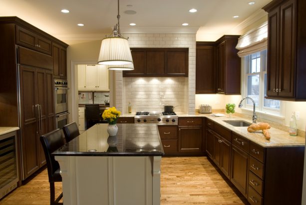
Actually, small kitchens like this are not suitable with dark stained cabinets. However, with the proper treatment, dark cabinets look perfectly fit in this kitchen.
This is a perfect example of a classic U-shaped kitchen completed with dark recessed panel cabinets, light granite countertops, a white subway tile backsplash, an undermount sink, and paneled appliances.
The cabinets are stained cherry wood, and the stain color is Clove, a perfect dark color to create a dramatic contrast to the countertops.
The round-edged granite countertops look a bit off-white, subtly different from the crisp white subway tile backsplash that seems to be from Sonoma Tiles.
To create a lovely focal point, the designer paints the island cabinet in a contrasting color to the perimeter. The island is from Woodharbor, and it is made of maple wood painted in “Coastal White”.
The white island is opposite the dark-stained perimeter cabinets. It is completed with Black Absolute Granite countertops with Hudson Valley 7712 2 Light Orleans Multi Island Light over it.
The black island countertop contrasts the light granite top on the kitchen cabinets.
12. Dark Tone Wood Kitchen Cabinets and Light Polished Countertops in a Mid-century Kitchen
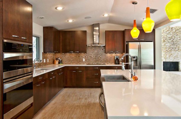
Even though this kitchen is not entirely in a modern style, it looks super fine with its polished elements. Every single thing in this kitchen looks clean, neat, and put together.
According to the designer, this is a 1960s kitchen that has been remodeled into something that looks more modern, more charming, and of course, more inviting.
It has dark tone wood cabinets, super white countertops, multicolored backsplash, silver travertine floor from Daltile, and stainless steel appliances. Thus, it has become a lovely mid-century kitchen.
The crisp white countertops enhance the light polished look in this kitchen. The multicolored backsplash complements both the dark cabinets and the light tops.
The combination of dark and light has transformed this kitchen, making it look more stylish. However, the designer decided to add an accent, but not to create a statement.
The orange and yellow hanging pendants were installed over the island to add more fun. They undoubtedly provide a contemporary look to this polished retro kitchen.
This is a recommended way to add an accent if you don’t want to deal with bold colors or statement pieces in your kitchen that may be too much for some.
13. Combination of Light Countertops, Sea-green, and Silver Color Scheme Paired with Dark Wood Cabinets to Add Warmth
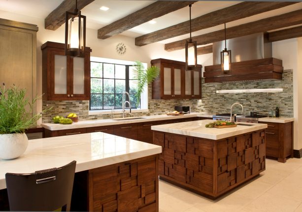
This enclosed kitchen has a lovely color combination. Even though it clearly has more than just a dark and light neutral color scheme, it has a rich combination.
The silver and creamy limestone is perfectly paired with walnut to create a vintage and warm feel. The limestone floor is used as a perfect backdrop of the walnut cabinets stained in a dark tone.
The great thing is the dark wood cabinetry is also completed with geometric patterns in the islands. The pattern gives more character to the kitchen.
The light-colored countertops are super white, creating a sleek look. They perfectly match the white glass doors in the upper cabinets.
The sea-green mosaic tile backsplash ties them together. You can see how this green backsplash tones down the brightness of polished white tops and walls and, at the same time, complement the dark-stained cabinets.
Mosaic tile will always be managed to create a luxurious look, especially if it is in a warm tone. Adding a sea-green backsplash is a great way to incorporate an accent without making it too overwhelming.
The pattern, along with the one on the islands, accentuates the kitchen flawlessly.
14. Merging Old Look and Contemporary Design by Pairing Dark Cabinets with Light Countertops, Backsplash, and Reclaimed Wood Elements
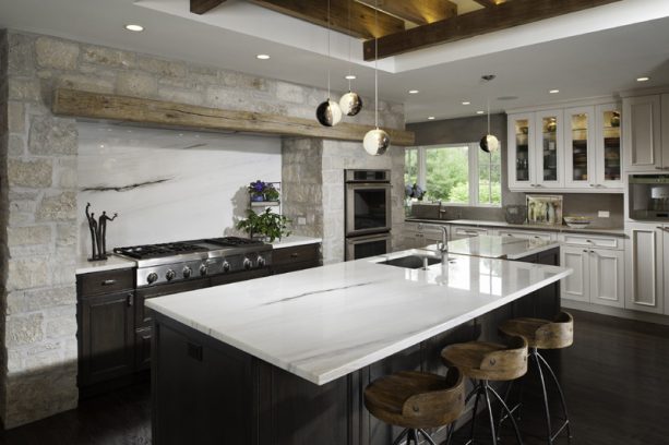
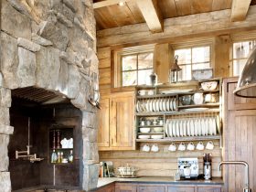
If you think a simple Tuscan kitchen won’t entirely fit your personal taste, maybe you should try the look of this kitchen. It has a Tuscan style, but it also has some contemporary elements.
The reclaimed wooden beams are paired with light calcutta marble countertops and suede limestone, uniting old-world charm with a more modern design.
The stove is surrounded by a rough-textured stone wall along with a wood exposed beam. The rough textured wall is also combined with a polished backsplash that is made of marble, similar to the countertops.
The contrasting texture between rough and polished adds more charm and character to this Tuscan kitchen.
The cabinetry is also two-toned. The island and the cabinet below the stove are stained in an extremely dark shade that looks almost black. On the other hand, the cabinets on the perimeter are stained in a crisp white shade.
Both of them are tied together by the dark tone wood floor that blends seamlessly to the dark stained cabinets.
If you have a spacious kitchen like this, it would be nice if you create a contrast not just through the classic black and white combo, but also from the texture.
The dark and light shade should not only be added to the cabinets and the countertops but also to the two-toned cabinetry. This way, your kitchen will look more extra and chic, creating a balanced and consistent look.
15. Extra Tips for Dark Kitchen Cabinets and Light Countertops
While they both create contrast and enhance the overall look of your kitchen, you need to know how to decorate them, so every single element in your kitchen will complement each other.
- You can have more fun by experimenting with other elements, like backsplashes, small appliances, window coverings, or accessories. It’s OK to lean towards the neutral side for the cabinets, countertops, and floors. But, you can also add a splash of fun. If you don’t like anything too bold, you can just add a pastel or soft color for the backsplash. Or, some patterned window coverings or rugs will also do.
- Add tons of natural light. Even though light countertops are enough to counteract the darkness of stained cabinets, you also need a sufficient amount of windows in your kitchen to provide you with natural light.
- Don’t be afraid to mix everything up. It is always lovely to have two-toned cabinetry. If you have a kitchen island, you can go with dark perimeter kitchen cabinets and a lighter-colored island. Or, you can also have a different shade of kitchen cabinets, one is dark, and the other one is softer and a bit lighter.
- A light-colored countertop will create a comfortable and welcoming ambiance if you pair it with light-colored floor tile. A light beige cream countertop, along with a light tone wood floor, will deliver a beach and airy atmosphere.
- If you want to achieve a dramatic elegance look in your kitchen, it means you have to create an intense contrast. Go with extremely dark cabinets and pair them with very light countertops. You can add a balancing tone for the backsplash, like gray or off-white.



Leave a Reply
View Comments