For some, installing a backsplash in the kitchen might be a minor detail that’s often overlooked.
While in fact, a backsplash can play a significant part in providing a terrific visual effect in your kitchen. It can give a direct punch in any kitchen style.
The problem is, what if you’ve got a window right in your backsplash zone?
When it comes to purpose, a backsplash’s main aim is to protect the surrounding wall. The cooking zone could be a messy area. Oil, water, or other ingredients might splash the walls around it. That’s when backsplash comes to the rescue.
Usually, a backsplash is made of a material that’s easy to clean, like marble, porcelain, or even glass.
If your kitchen windows are right in the cooking zone, it would be wise to build a backsplash around them. It would make your kitchen look more attractive and protect the area around your window from the unpleasant messes a kitchen usually has.
The best way to embrace the window kitchen in a backsplash area is by making it a focal point. It means you must work from the window and continue to the outer area.
Continuing the backsplash from the window to the expansive area will make your kitchen look well-defined and cohesive.
There are many types of tiles for backsplash around the kitchen window out there. It’s easy to say that backsplash tiles are often versatile.
But, if you want a more specific design for a certain style, you can opt for a fun-designed and bold-colored tile.
Here we’ve rounded up the terrific designs of backsplash around kitchen windows that you can use to create a focal point:
- Custom Color Blend of Stix Tile for Backsplash Around Kitchen Window
- Marble Tile Backsplash Around Kitchen Window in a Polished Finish
- Full Height Custom Gray Backsplash Around Double Kitchen Window
- Walker Zanger Tile in a Blue Backsplash Around The Kitchen Window
- Tundra Gray Marble Polished Tile Backsplash Around Triple Kitchen Window
- Iridescent Milk Glass Tile Backsplash Around a Single Kitchen Window
- Boral Thin Brick Backsplash Around Two Separated Kitchen Windows
- Herringbone Patterned Tile Backsplash Around the Kitchen Windows
- Glass Tile in a Lunar Gray Color Backsplash Around a White Kitchen Window
- Walker Zanger Duquesa Fatima Tile Backsplash Around Grid Kitchen Window
- Island Stone Tile in Breeze and Pure Silk Colored Backsplash Around Kitchen Window
- Beige-Colored Backsplash Around a Huge Arched Kitchen Window
- Coachella Blue Backsplash Around a Recessed Kitchen Window
- Graphic-Designed Backsplash Around a Folding Kitchen Window
- Combination of Glass and Marble Tile Backsplash Around the Kitchen Windows
1. Custom Color Blend of Stix Tile for Backsplash Around Kitchen Window
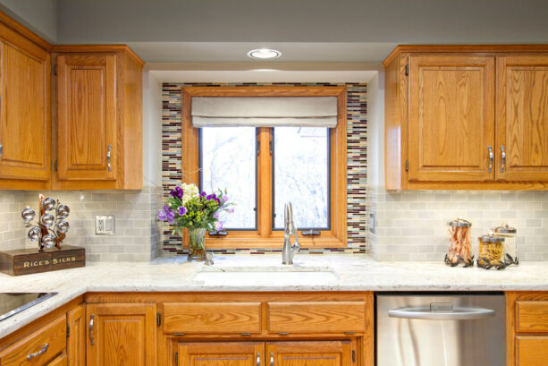
The designer of this project managed to create a stunning focal point out of the kitchen window. It’s plain to see how they differentiate the backsplash above the perimeter cabinets and the one over the sink.
The area over the sink is filled with a double window completed with oak trim to match the oak cabinetry that the owners refused to replace to keep the classic style of this kitchen.
The wall above the cooking zone is protected by beautifully handmade tiles from Mercury Mosaics. They come in 2”x4” sizes and a light gray color.
On the other hand, the backsplash around the oak-trimmed kitchen window is different. They are “stix” tiles from Mercury Mosaics, too. But, the designer did some blending around the window to create a custom mixed look.
Using a different color and design for the backsplash is an excellent way to create a focal point.
This works better if your kitchen window is a typical casement one, the most common type of kitchen window that usually doesn’t attract too much attention.
Decorating it by installing a custom blend backsplash that contrasts the surrounding backsplash will make the window look pop, making people forget that it’s a common casement window.
2. Marble Tile Backsplash Around Kitchen Window in a Polished Finish
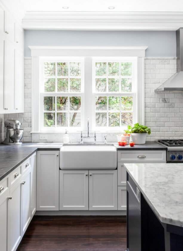
This backsplash’s ending point is around a few inches before the window trim ends. It’s full enough to create extra protection for the walls around the window.
In this project, the designer intended to blend the window and the backsplash, creating a unified look.
The windows are a common double-hung type, installed side by side, completed with a thick white trim that will remind you of a craftsman style. The white trim corresponds well with the white backsplash tile around.
The backsplash is marble tile, “Calcutta Ashlar 3×6” in a polished finish to achieve a glossy look like this. The marble tile is designed like a brick to showcase a classic look that totally fits this traditional kitchen.
The designer installed Carrara marble countertops in a dark finish to create a contrast. Aside from contrasting the backsplash tile, these dark countertops are also meant to look odd against the white trimmed windows over the sink.
3. Full Height Custom Gray Backsplash Around Double Kitchen Window
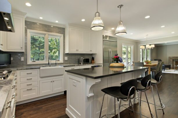
This traditional kitchen looks warm and elegant because of the color scheme that the designer managed to make.
Like in any traditional kitchen, the color palette is neutral, dominated by black, white, and gray. But look how the backsplash instantly boosts the elegance in this kitchen.
The backsplash is full height, starting from the countertop and ending right below the ceiling.
This full-height backsplash will provide extra protection to the wall above the stove and around the window. Since these double windows are quite tall, it’s reasonable to create a full-height backsplash.
The backsplash itself is a custom gray color. This is a watercolor tile in 2×8 from Pratt & Larson.
Look how the gray of the backsplash, under a certain light, looks a bit green. This grayish green adds a pop of color to the neutral color setting without making it too dramatic.
The tile is also meant to contrast the countertops, which are quartzite from Perimeter in White Fantasy color. It’s also supposed to make the white trimmed windows and the white upper cabinet looks shinier, brighter, and more spotless.
4. Walker Zanger Tile in a Blue Backsplash Around The Kitchen Window
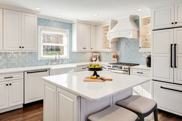
If you always like the idea of combining modern and traditional, you should adopt this idea for your kitchen remodeling project.
The single double-hung window painted in white with a typical shutter will surely give you a classic look you’ve always wanted.
Moreover, the white trimmed window matches the cabinets, the countertops, and even the island to create an all-white design.
The modern touch comes from the backsplash around the kitchen window. The backsplash fills the whole wall area in the cooking zone right to the ceiling.
It’s a tile from Walker Zanger Studio Moderne in a Moonstone color, which is obviously blue. There are four other color options: Plaster, Smoke, Ming Blue, and Sterling. All of them have a similar glossy and polished finish like this.
Blue is not on a neutral side. Adding blue in a neutral color palette will surely add a splash of color. But this shade of blue is too soft to be bold.
That doesn’t change the fact that it looks pleasant against the white color around, though.
If you want to add a modern touch to your traditional kitchen to create a transitional look but don’t want to look too dramatic, always opt for a soft, light shade like this.
Blue is known as a relaxing and calming color. But apart from that, it’s also believed able to boost appetite. That’s why incorporating blue in your kitchen/dining room would always be a good idea.
5. Tundra Gray Marble Polished Tile Backsplash Around Triple Kitchen Window
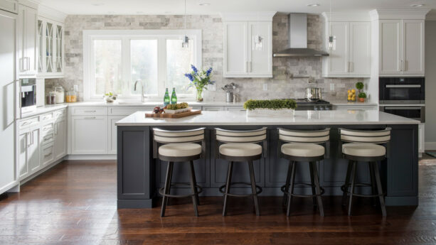
If you don’t want to stray too far from the neutral color palette, you can use one of the neutral shades to accentuate the whole room.
Contrary to popular belief, neutral shades are not boring if you know how to handle them. The backsplash around this kitchen window proves it.
The backsplash is in gray, one of the neutral shades. In fact, this tile is polished marble 3×6 in Tundra Gray color from MSI Tile.
Look how it beautifully contrasts the white cabinets and white countertop, which is Quartz by Cambria called Torquay.
The triple kitchen windows over the sink are also completed with thick trim painted in white, totally a craftsman style. The gray backsplash makes the windows look more pop and prominent.
The question is, how to make the gray look extra like this? There are many ways to use a versatile shade like this, but one of them is by creating a gradation like this.
The gray gradation in this backsplash adds more depth and dimension to the kitchen. Even though it’s a plain shade, the gray backsplash in this kitchen looks more varied; it’s as though they came in many different shades, makings it pretty.
6. Iridescent Milk Glass Tile Backsplash Around a Single Kitchen Window
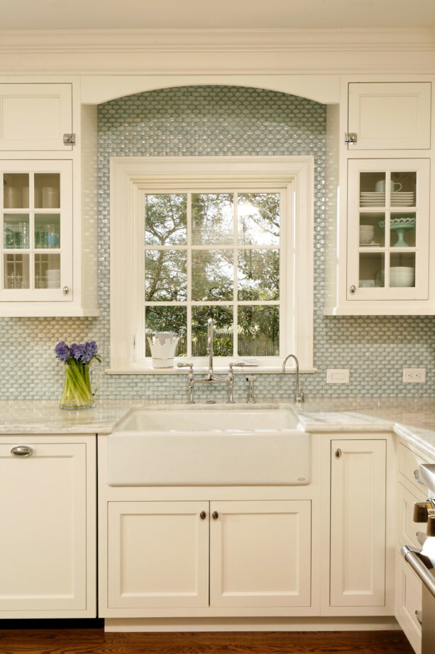
Green is always able to freshen the room, adding a natural touch without too much effort. One of the good ways to incorporate green in your kitchen is through the backsplash.
This full-height backsplash covers the wall around the window all the way up to the ceiling.
The window is a single type with grids completed with thick white trim to frame it.
This window is bracketed by two upper cabinets, and these two uppers create an arched top above the window, adding visual interest to the area. And that’s when the backsplash stops.
The backsplash is custom designed by Susan Jablon Mosaics. It’s an iridescent milk glass tile in a basketweave pattern. The green shade is not too bold, but it’s more than enough to create an accent.
To top it off, the basketweave pattern is also not the typical design of a backsplash. It makes this glass tile look unique and different from the others.
7. Boral Thin Brick Backsplash Around Two Separated Kitchen Windows
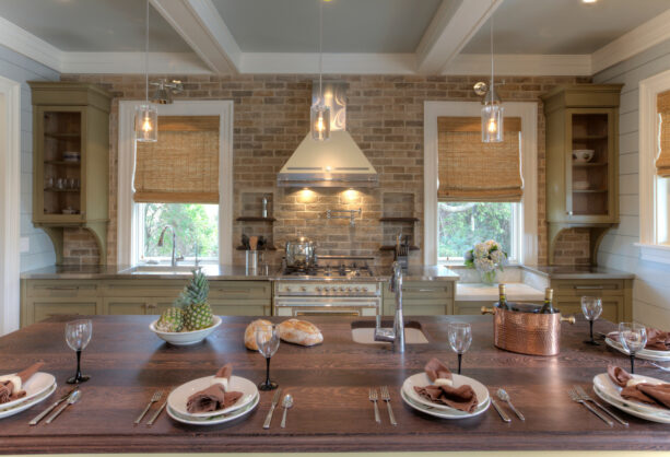
Tile is known as the most common material for kitchen backsplash, but it doesn’t mean that tile is the only option. You can use other materials to create a more fitting design for the theme you picked for your kitchen.
For example, the designer preferred to use brick instead of tile for the backsplash in this modern cottage kitchen.
The brick backsplash runs from above the countertop to the ceiling. It perfectly wraps two separated kitchen windows bracketing the stove.
One of the windows is over the sink, while another one is over a recessed area meant for decoration only.
The backsplash is thin brick from Boral in Tuscan Blend color. When it comes to maintenance, you can always seal brick the way you seal granite. It’s better to discuss it with the brick manufacturer for further information, though.
The brick backsplash is unique and unusual. Make sure you pick the right color to complement the setting of your kitchen.
Considering the color of the bricks will also play a great part in the visual effect. For example, in this kitchen, the grayish green color complements the green cabinet but contrasts with the white trimmed windows.
8. Herringbone Patterned Tile Backsplash Around the Kitchen Windows
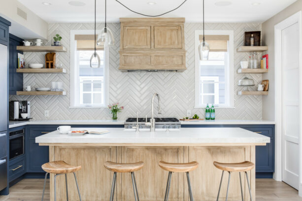
It’s an easy-to-use beach-style theme in a kitchen. As long as you’re able to incorporate blue or green, you’ll be fine.
In this kitchen, the cabinets are painted blue to represent the ocean and the beach, while the rest of the room is finished in white and/or natural wood.
The backsplash is also in creamy white color, similar to the countertops and the window trim, even though the last two look brighter and crisper.
This is a herringbone patterned backsplash surrounding the kitchen window in 2”x8”. The herringbone pattern gives more texture to the whole area. It adds more character, too, making the entire kitchen look more pleasant.
Adding a texture to a polished kitchen will not only make it appear richer and more attractive but will also create a contrast. Look how the backsplash contrasts the polished backsplash.
The herringbone backsplash is able to add width to a space. It’s because the pattern needs the tiles to be laid diagonally, making the eye follow the line to the far end of the kitchen.
If you’ve got a small window area over your sink and cooking zone, always rely on a herringbone pattern to make it look wider.
It won’t hurt to know, too, that the herringbone pattern is never out of style. Indeed, it’s a classic pattern. But if you want to be trendy, stay away from glass tile, not the herringbone pattern.
9. Glass Tile in a Lunar Gray Color Backsplash Around a White Kitchen Window
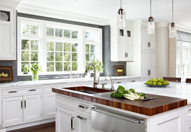
This gray backsplash is able to accentuate the all-white traditional kitchen. This glass tile is backsplash from AKDO in Lunar Gray color with a medium clear finish in 3×6.
Glass tile backsplash may not be in trend anymore, but we can’t deny that there are several advantages you’ve got from having glass tile backsplash.
They are easy to clean. It means that you don’t have to worry about the messy ingredients that may splash onto the tiles. They won’t be absorbed into the glass. You just have to wipe it clean.
Glass tile is also resistant to mildew and mold. Compared to other materials, glass is considered environmentally friendly, so this type of backsplash needs to add to a green, eco-friendly house.
The light reflective character of the glass tile backsplash makes it look more beautiful. It makes the backsplash looks glossy even without additional coating or treatment.
In this kitchen, the dark gray glass tile doesn’t only contrast with the white trimmed kitchen windows but also the matte finish of it.
See how the glossy dark gray backsplash around the kitchen window works together to create a lovely accent and focal point.
10. Walker Zanger Duquesa Fatima Tile Backsplash Around Grid Kitchen Window
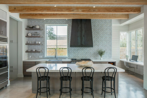
Frankly, the design of the area around this kitchen window is plain and bare.
Unlike the other kitchen designs, where the window is usually surrounded by cabinets, this simple grid window looks extra minimalist. It doesn’t even have trim around to frame it.
Instead of full cabinetry, the designer only installed wooden shelves on the left side of the windows.
To counteract the plainness of this design, the designer installed a playful backsplash.
The backsplash tile is from Walker Zanger Duquesa Fatima in Mezzanotte color. It’s good to see how the tile follows the line of the base cabinet; it ends where the cabinet stops.
But for the height, this backsplash goes all the way up to the ceiling, shielding the walls above the cooking zone and around the window.
We can’t deny that this is a fun and playful tile. But, if you use it in a crowded area with full cabinets and thick, trimmed windows, it can be overwhelming.
The thing is if you want to incorporate a tile like this and make it full height, make sure you make the surrounding area clear and clutter-free.
Such a backsplash works better in a transitional kitchen, for it brings a modern vibe. It would be awesome to contrast it with many traditional elements.
11. Island Stone Tile in Breeze and Pure Silk Colored Backsplash Around Kitchen Window
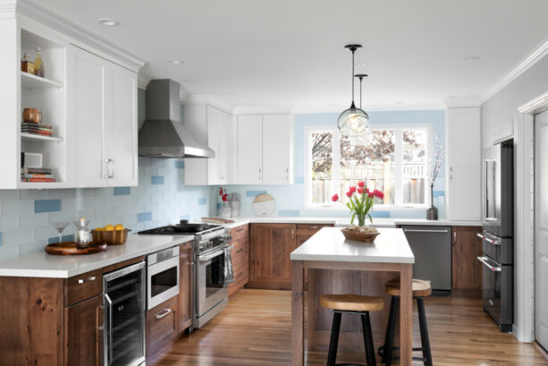
Judging by the hickory cabinetry, the wood floor, and the all-white design, it’s obvious that this kitchen has a traditional style.
But, the blue backsplash adds a beach vibe and a cozy cottage nuance to the kitchen, making it look more transitional than traditional. Such a combination creates an earthy and bright kitchen.
Additionally, the designer used two colors at once for the backsplash. Combining two colors for the tile backsplash will add more dimension to the room, creating a visually aesthetic area that works better than a solid-colored tile.
This backsplash tile is from Island Stone, and the colors are Breeze and Pure Silk.
The popping of darker blue around the softer blue on the backsplash provides a tranquilizing ambiance.
This backsplash tile is full to the ceiling and covers the whole wall area above the countertop. And since this is an L-shaped cabinet, the backsplash follows its line.
The huge window above the sink makes the kitchen help the kitchen brighter. It’s framed by white trim, a typical design of a windowed kitchen, and surrounded by the blue backsplash that subtly contrasts it.
12. Beige-Colored Backsplash Around a Huge Arched Kitchen Window
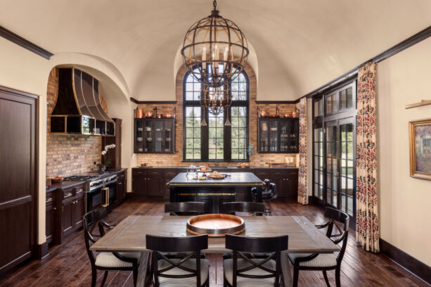
The combination of dark tone wood and beige color in this kitchen tells us obviously that this is a traditional kitchen.
Moreover, there are many classic elements that support the conventional look of this kitchen. One of them is the brick backsplash. Even though brick is a timeless element, it’s usually used in many traditional settings.
The cooking zones are separated into two areas, so even though they created an L-shaped, they are separated by the wall. However, the designer covered the wall of both areas with a brick backsplash.
What makes it different from the previous pictures, the kitchen window here is tall and imposing with an arched top, totally reminding you of a Mediterranean style.
The area around the window is different from the rest of the wall. It is recessed, creating a nook-like on the wall.
The brick backsplash reaches the top of the window but is laid in a different pattern from the rest. The rest of the brick backsplash is laid horizontally, but the window top area has a vertical pattern, accommodating the arched design.
The backsplash on both sides of the window doesn’t reach the arched ceiling. It stops a few inches above the upper cabinets, and the designer used trim to border the area where the backsplash ends, and the wall starts.
13. Coachella Blue Backsplash Around a Recessed Kitchen Window
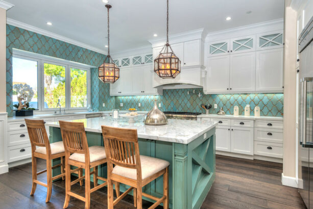
This kitchen looks stunning because of the backsplash. It proves that backsplash plays a great part in creating a visually aesthetic kitchen, which means that this is an element that shouldn’t be ignored.
Look how the pretty backsplash fills the walls above the cooking zone, around the upper cabinets, and the windows.
Usually, many people opt for backsplash tile that contrasts the window trim or the countertop. But the homeowners’ consideration is the island.
It’s just beautiful how the island perfectly matches the backsplash, but at the same time, they have contrasting textures, too.
The tile backsplash is from ARTO in Coachella Blue, which is actually a turquoise color. But it is accentuated with a gold tone. It turns out that turquoise and gold complement each other, and they work together to boost elegance in the room.
The window has no trim whatsoever, but it is recessed to the wall, creating a nook. Even though it is not completed with a trim, it has a sill that’s also covered with the turquoise backsplash.
Covering the window sill with a tile might be counterproductive, but it’s good to create a consistent look throughout the kitchen.
14. Graphic-Designed Backsplash Around a Folding Kitchen Window
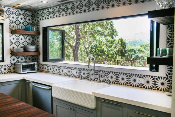
This backsplash tile is anything but ordinary. It is a kind of backsplash that has a rustic and modern design at the same time.
Since this is a full-patterned tile, it would be wise if you combined it with a minimalist and plain area. If you’re wondering, this backsplash was designed by Lisa Bakamis.
To promote the minimalist style, the designer chose a long folding window instead of a double hung with a trim. This long window is framed by a white border, but it blends seamlessly with the backsplash, so the trim is barely noticeable.
Instead of upper cabinets, there are only open wooden shelves to store dinnerware, and it turns out that the dark tone wood looks in contrast to the black and white full patterned backsplash tile. It beautifully wraps the window, from the countertop to the ceiling.
Even though it is tempting to install this kind of backsplash, there are some considerations you should put into account.
The beautiful design can increase your home resale value, but the patterned design is not timeless. Someday, it will grow out of style, and if you’re following the trend, you might have to replace it.
15. Combination of Glass and Marble Tile Backsplash Around the Kitchen Windows
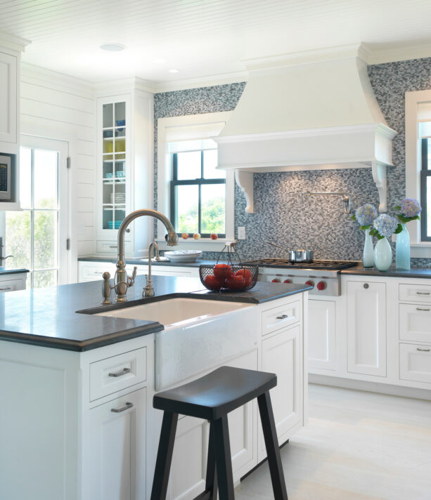
This is a classic kitchen with a touch of modern style.
The backsplash is not only a glass tile but also marble tile. The combination delivers a trendy and stylish look that starts from the slate countertops to below the ceiling, a few inches above the window sashes.
These tiles come in a marine blue color, delivering a splash of color that looks pop against the black and white setting. All of these mosaic tiles are from ARTISTIC TILE.
Unlike glass tile, which looks classic, marble tile is trendy, luxurious, and elegant. No wonder because marble itself is an element that’s often associated with class and elegance.
Incorporating marble tile in your kitchen means you make your kitchen appear brighter. A kitchen with a marble tile backsplash will have a look that can’t be imitated easily.
The pattern and the color of this marble and glass backsplash make the area around the kitchen window an accent. It looks prominent against the all-white cabinets and the window trim.
The window features a black and white combo, similar to the entire kitchen. It is made of black metal and surrounded by white trim with a white shade.
It’s lovely to see how the marine blue backsplash contrasts the black and white window and the cabinets. This tile works best in a beach-style kitchen because the shade of blue is perfect to represent the beach and the ocean.
To add more texture, use a white panel laid in a horizontal position for the rest of the wall.
Closing
Finishing your backsplash is easy, and it will create a different look.
When it comes to the material, it’s recommended to use caulk instead of grout to finish the seam. It’s because grout is prone to cracking in an application around the window.
It’s better to use tile edging trim or bullnose tile to work your way up to the window to complete the upper edge of the tile.
Most of the pictures above show a full-height backsplash. But the question is, how high a backsplash should be?
Well, determining your backsplash height depends on the purpose of why you installed it in the first place. Backsplash has two main purposes, to protect the wall from cooking disasters and to create an aesthetic look.
A backsplash with a standard height is around four inches above the countertop.
Commonly, the material is the same as the countertop to create a unified look. It means that the backsplash stops at the mid area of the window, and the upper window is surrounded by painted walls.
While you didn’t see them on the list above, having this kind of backsplash around, this type of backsplash has some benefits.
One of them is you can create a more creative and unique way to decorate your kitchen. The wall above the backsplash can be painted or wallpapered.
On the other hand, a full-height backsplash starts right where the countertop ends and ends below the ceiling or above the upper cabinets.
If you prefer to use a full-height backsplash, you have to find the natural ending point, like the top of the upper cabinet, above the window ledge, or below the ceiling
Those are the most usual ending points of full height backsplash around the kitchen window.
Even though this option is more expensive than the standard height backsplash, its visual effect of it is extremely striking.
You can proudly say that you can do anything with your backsplash around the kitchen window, and the ceiling is the limit!




Leave a Reply
View Comments