If you want to induce a calm and relaxing ambiance in your bathroom and a homey and bright feeling at the same time, using beige tiles is your best bet.
Unlike white, beige will brighten up your bathroom, make it look bigger, and provide a neutral shade that can easily be paired with other shades without the starkness of white.
- Blue Paint Color – Sherwin Williams Rain SW 6219
- Green Paint Color – Sherwin Williams Sea Salt
- Sherwin Williams – Meander Blue
- Benjamin Moore – Violet Mist
- Sherwin Williams – Expressive Plum
- Sherwin Williams – Herbaceous CL1924M
- Benjamin Moore – Natural Cream
- Benjamin Moore – Putnam Ivory
- Benjamin Moore – Guilford Green
- Valspar – Sunwash
- Makoto Matte Ceramic Wall Tile in Kuroi Black
- Benjamin Moore – Sabre Gray
- Benjamin Moore – Raspberry Mousse
- Valspar – Nautical
Some people are discouraged from using white in their rooms, especially in the bathroom, because white is often associated with a hospital. The color resembles sterility and inhumane cleanliness that make people a bit uncomfortable.
That’s part of the reason why they prefer to stay away from white, or at least not use a lot of it, in their rooms. If that’s the case, beige is the best alternative.
Beige itself comes in several shades. A very light beige may look like white, but the darker one seems pretty close to soft brown.
Beige also has different tones: cool, warm, and true neutral.
While cool beiges have grey-blue undertones, the warm ones have more red and orange undertones. Neutral beiges are the most versatile ones because they have no undertones and can perfectly be paired with any shade.
Despite the shade, you can have as much fun with them just like you’d have with white. Beige can also be considered a neutral shade. And since using all-beige in your bathroom might look plain and boring, here’s how to combine the beige tiles in your bathroom. From the safe combination to the whimsical and absurd one, below are the cool tones to be paired with beige tile:
1. Blue Paint Color – Sherwin Williams Rain SW 6219
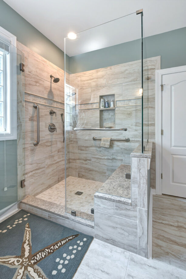
Actually, beige tile and grayish blue don’t really complement each other. However, a matching game is not really important if you want to achieve a certain look with the wall.
In this case, the homeowners wanted to incorporate a beach-style look. And even though blue doesn’t exclusively belong to the coastal look, most people still use it to represent the beach and the ocean.
That’s why the designer picked Sherwin Williams Rain SW 6219 to paint the walls, side by side with the beige tiles in the shower stall and on the floor.
These grayish blue walls are also meant to match the nautical-themed rug in front of the shower stall.
Why should it be grayish blue instead of a baby blue or a sky blue? Personal taste aside, this warm hue is more suitable to be paired with the cool-toned beige in this bathroom. Plus, grayish blue like this is closer to white than any shade of blue.
See how the designer used white elements to tie the SW 6219 paint color and the beige tile.
2. Green Paint Color – Sherwin Williams Sea Salt
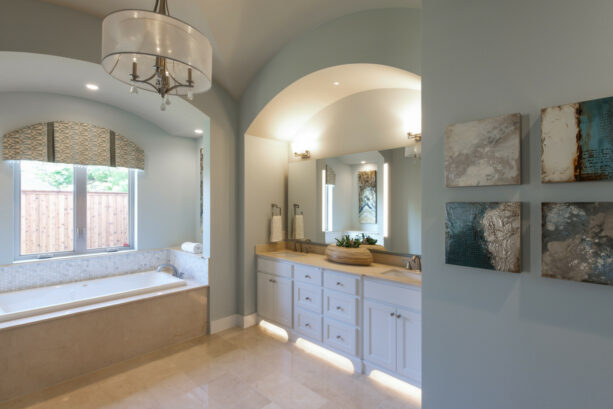
It seems that the entire wall of this bathroom is painted in Sherwin Williams – Sea Salt, the light green tone that looks cool instead of warm.
Such a combination will give you a stylish transitional style. Look how the light green shade opens up the already spacious bathroom, making it look even grander.
The beige tile on the floor and the bathtub adds a more down-to-earth vibe because beige is one of the earthy tones that some people often add to their rooms to incorporate a natural look.
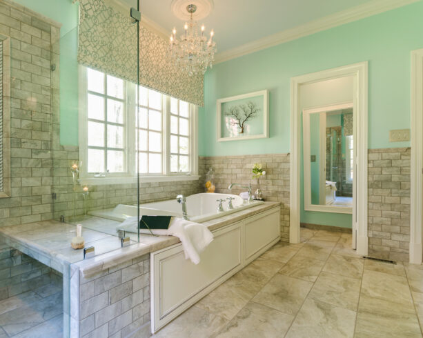
3. Sherwin Williams – Meander Blue
Want to make something more dramatic and eye-catching?
Try to use this kind of blue. To be honest, this one is rather turquoise than blue because we can see clearly the combination of blue and green on these walls.
The lower part of them is filled with greige tiles. Greige is a perfect mix of gray and beige, a commonly new shade that people use to instantly boost the elegance in their rooms.
These greige tiles are also combined with the real beige tiles on the floor.
The turquoise color is Sherwin Williams – Meander Blue, a charming color to give your bathroom a freshening look. Being put side by side with greige tiles makes this color look pop because they contrast each other.
What ties them together is the white trim. It’s lovely to see how turquoise walls complement the white trim but contrast the beige tiles.
On the other hand, the beige tiles also work well with the white trim, but they look odd against the turquoise walls. What a considerate and balanced color composition.
4. Benjamin Moore – Violet Mist
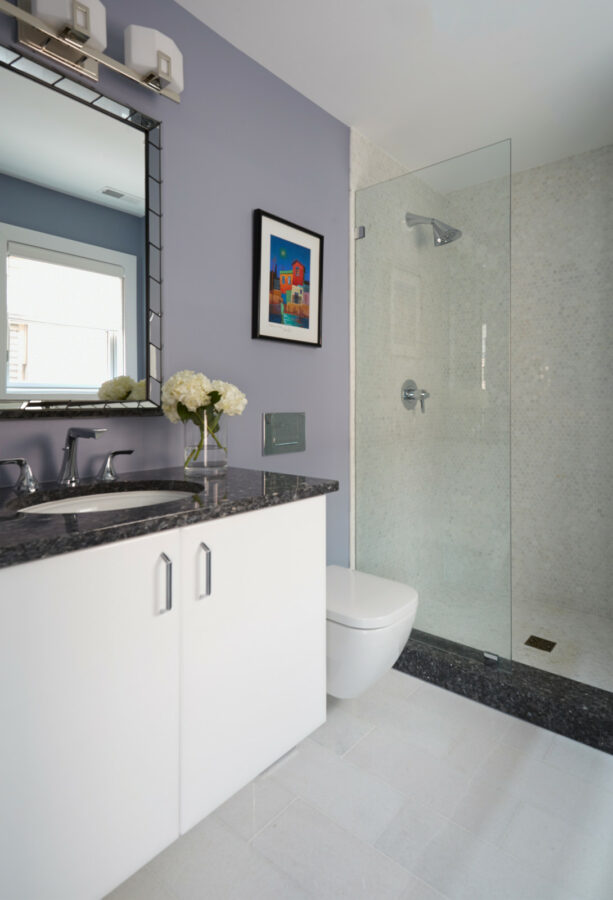
Now, let’s move on to another soft shade other than blues. The light violet walls make this bathroom look sweet, calm, and inviting.
Who thought that purple color like this would be the shade to opt for when people used beige tiles?
It might not be the first shade that comes to mind if you want to complement your beige tiles. But this surely would be the best option if you want to design a contemporary bathroom.
In a contemporary room, everything is possible. You can mix and match any shade as long as you know how to combine the tones.
In this bathroom, the walls are painted in Benjamin Moore – Violet Mist. The floor and shower stall wall are covered with beige tiles. In order to tie them all together, it surely takes neutral colors.
The designer didn’t only use one but two neutral colors at once. The black countertop, the black tile accent, and the white vanity and toilet are meant to tone down the clash of violet mist and beige.
It shows that no matter how weird the color combination you choose for your room, as long as you can combine it with neutral colors, you’ll be fine.
5. Sherwin Williams – Expressive Plum
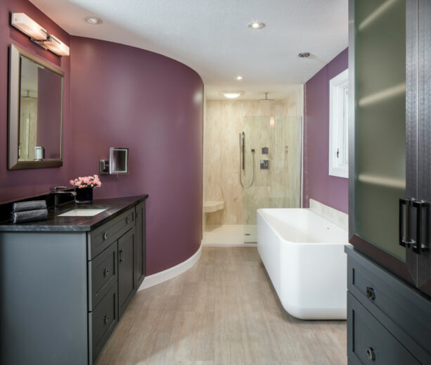
If you want something more dramatic, more aggressive, yet more appealing, you can choose this shade of purple.
The walls, both the curved and the flat ones, are painted in Sherwin Williams – Expressive Plum. The plum shade is neither dark nor light, actually. But it’s rich and deep enough to outdo the effect of beige.
Installing beige tiles in your bathroom is a guarantee to make it look soft, elegant, and luxurious.
But some agree that all-beige rooms tend to look boring and plain. You need an extra boost to counteract the beige’s dullness. And this shade is the right weapon to combat it.
Sometimes, you really need to go bold all the way. Look how the designer still combined the plum walls with the matte black vanity and cabinet with glossy black countertops.
Actually, black is not a bold color; it’s neutral. But when you place it side by side with plum, they work together to create a dramatic impression in your room.
The beige tiles, in this case, are only meant to soften the dramatic effect of plum and black.
6. Sherwin Williams – Herbaceous CL1924M
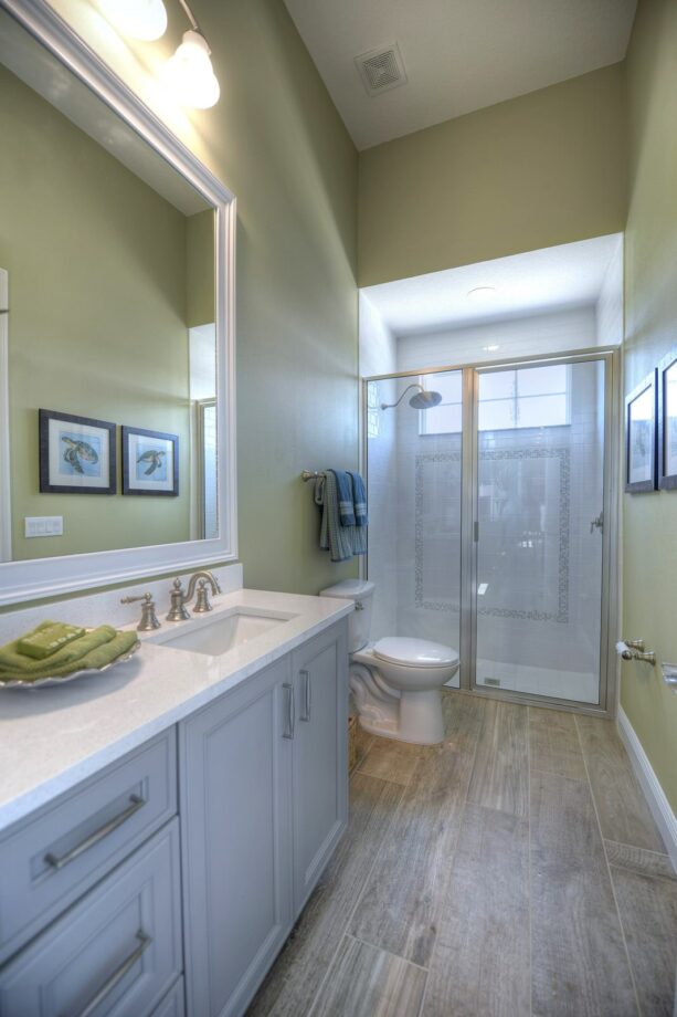
To design a transitional bathroom, you have to be able to combine traditional and modern elements at the same time.
In this project, the designer managed to do it successfully. The traditional element can be seen through the wood floor and the beige tiles in the shower stall.
Beige is considered one of the traditional shades because it has a calm and relaxing effect.
Adding a modern vibe to a conventional setting like this is easy. All you have to do is just add a pop of color.
A splash of bright color will always be able to liven up the room, creating a more cheerful space that combats the plainness of a neutral color scheme.
The splash of color in this bathroom is on the walls, which are painted in Sherwin Williams – Herbaceous CL1924M. It’s a soft green that looks even more, inviting with the right amount of light to highlight them.
This shade of green is not totally bold and vibrant, but it’s enough to bring out a modern vibe to the beige tiled bathroom.
It will be perfect if you add white as an accent, too. Remember that white is a must-have shade to add if you combine two contrasting and clashing shades together.
7. Benjamin Moore – Natural Cream
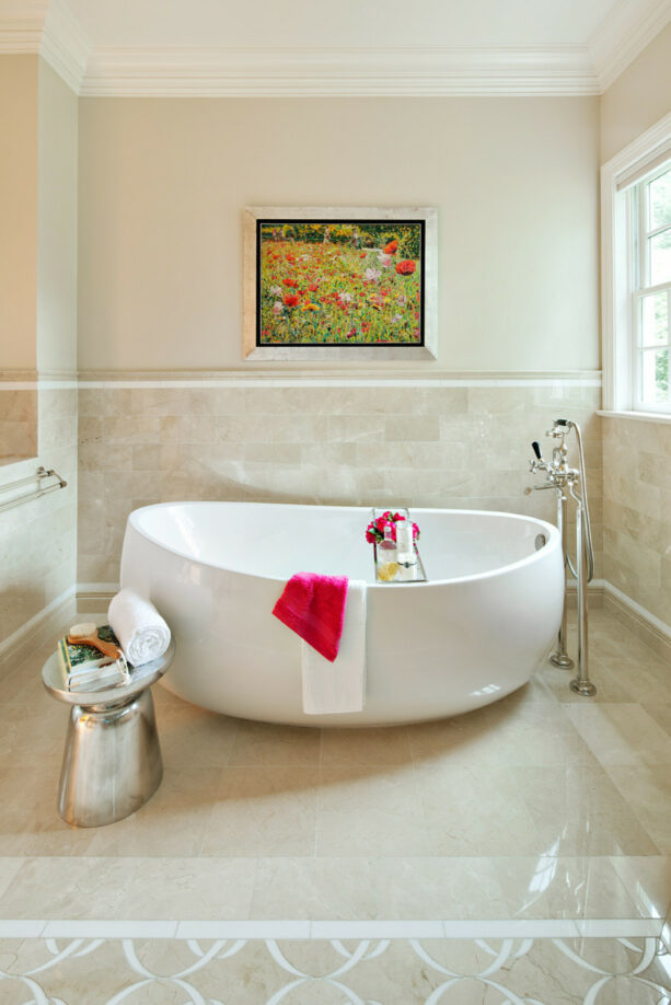
It’s pretty clear that the homeowners didn’t want to draw too much attention to their bathroom walls.
Instead of pairing the beige tiles with bright and bold shades, they preferred to paint the walls in a cream color.
The cream color is actually Benjamin Moore – Natural Cream. Look how this cream shade blends seamlessly with the beige tiles.
The cream and beige shades are accentuated with white edging. This combination delivers a classic and traditional look that will look nice in a small bathroom.
However, the homeowners wanted to incorporate a contemporary style instead of a traditional one. But at the same time, they don’t want to use too much bold color.
The solution is easy. They just needed to combine the beige tiles and the similarly soft and neutral-colored walls to serve as a backdrop.
It means that the homeowners had to add accent colors, but only in splashes throughout the room.
You see how the bright red towel is added to the bathtub, and the painting of bright red flowers hung on the cream walls. Those are meant to be an accent.
This definitely tells us something. If we want to stay neutral with the background, we need to add some bright-colored decorative items (in the same color) to create a contemporary look.
8. Benjamin Moore – Putnam Ivory
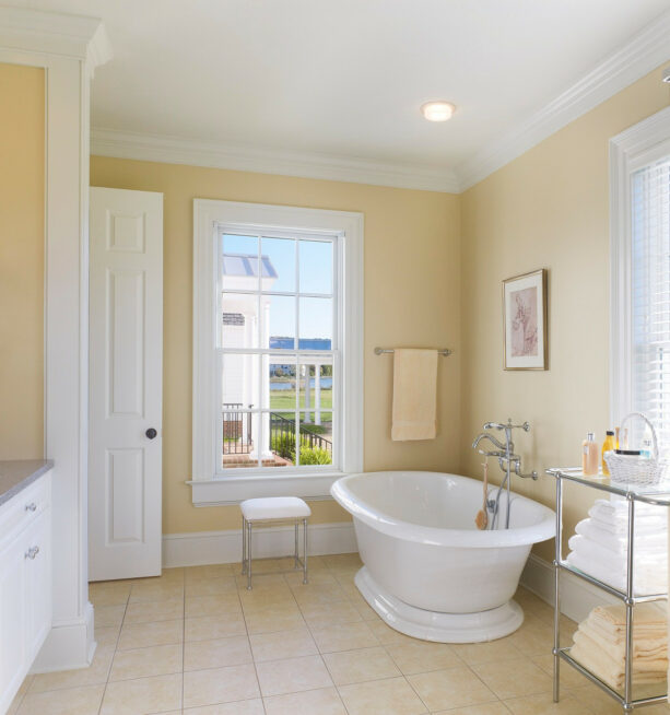
Even though the walls look yellow in this picture, they are painted in Benjamin Moore – Putnam Ivory, which is more cream than yellow.
Yet, the cream tone is a bit darker and deeper than the previous one, so it looks more yellowish.
This is the shade you should choose if you want to make your beige tile look more attractive.
Standing alone, beige, will make your room look unattractive. If you only pair it with white, you only get a super simple and way too mainstream look that no one would look twice.
You need something different but not as loud as red, deep purple, or dark blue. And this creamy yellow shade is your best bet.
The combination of deep cream, beige, and white will deliver a soft, sweet, and calming ambiance.
These colors are perfect for country or farmhouse style, a design that will remind you of a small house in a village where you grew up back then, a situation where you feel calm and homey.
9. Benjamin Moore – Guilford Green
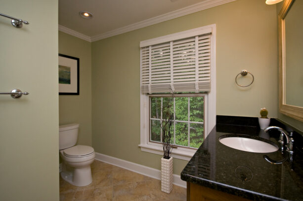
You’ve seen some greens before, but it’s nowhere near this lovely soft olive green.
This green shade will turn your bathroom into a relaxing spa because this color induces a calming sensation.
The green walls are actually painted in Benjamin Moore – Guilford Green.
They are combined with dark beige tiles on the floor, white trim, and baseboard as the accent. It seems that the designer wanted to add more characters to this bathroom.
The cherry cabinets paired with black granite countertops bring out a modern vibe, similar to the chrome fixtures that add sparkle to the room.
The Guilford Green, even though it can’t be considered a neutral shade, it’s still a soft and light shade. When combined with beige tiles, they deliver a traditional design.
This bathroom’s traditional and modern elements unite together to create a perfect transitional design.
10. Valspar – Sunwash
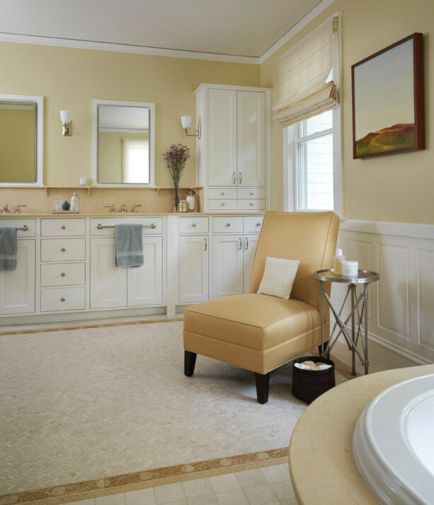
This buttery yellow looks lovely when juxtaposed with the beige tiles on the wall. The yellow shade is actually a Sunwash color from Valspar.
Despite the fact that it’s yellow, there’s nothing too bold, bright, or vibrant in this shade. On the other hand, this paint color is calm and comforting. That’s why you can’t use this paint color to add a splash of color in a bathroom.
This shade is not meant to contrast with beige. It’s supposed to complement it, creating a classic look. That’s why they look best in a traditional setting.
You won’t find any pop of color in a traditional room. Every color should match each other, making cohesion.
And what’s more complementing to beige than yellow?
Because, after all, beige also has a bit of yellow tone in it. Pairing it with a soft yellow shade will only make the yellow tone in the beige tiles look more prominent.
If you combine a soft yellow wall with beige tiles like this, don’t forget to use white as a neutral accent. You can also add a deeper tone to the decorations, like gold or dark brown.
11. Makoto Matte Ceramic Wall Tile in Kuroi Black
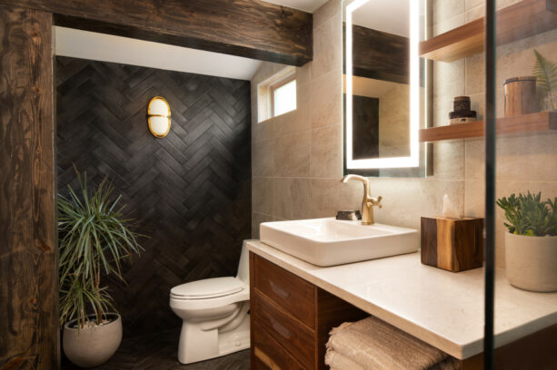
Who said it only takes a painted wall to complete the beige tiles?
You can also use tile on tile look in your bathroom to create unison.
In fact, it would be even better to cover your walls with tiles from floor to ceiling, so you don’t have to worry about the splash of water that may ruin the paint color and the wall material.
In this bathroom, the designer covered the shower stall wall with herringbone tiles, which are Makoto Matte Ceramic Wall Tile in Kuroi Black. Look how different the herringbone pattern with the typical pattern of the beige tiles next to it.
We all agree that black and beige don’t complement each other. Yet, in this bathroom, we can see that beige can work as an alternative to white.
The Black and white color combo is timeless and versatile, but they’re also way too common. It’s normal if you want to get more fresh air by replacing white with beige. After all, beige and black still contrast each other.
It’s the fact that beige and black don’t match that makes black the best color for an accent wall.
The designer wanted to make a statement through the accent wall, and it seems that they successfully did it.
It’s just awesome to see how these herringbone tiles get the most spotlight, leaving the beige tiles to stay in the background.
12. Benjamin Moore – Sabre Gray
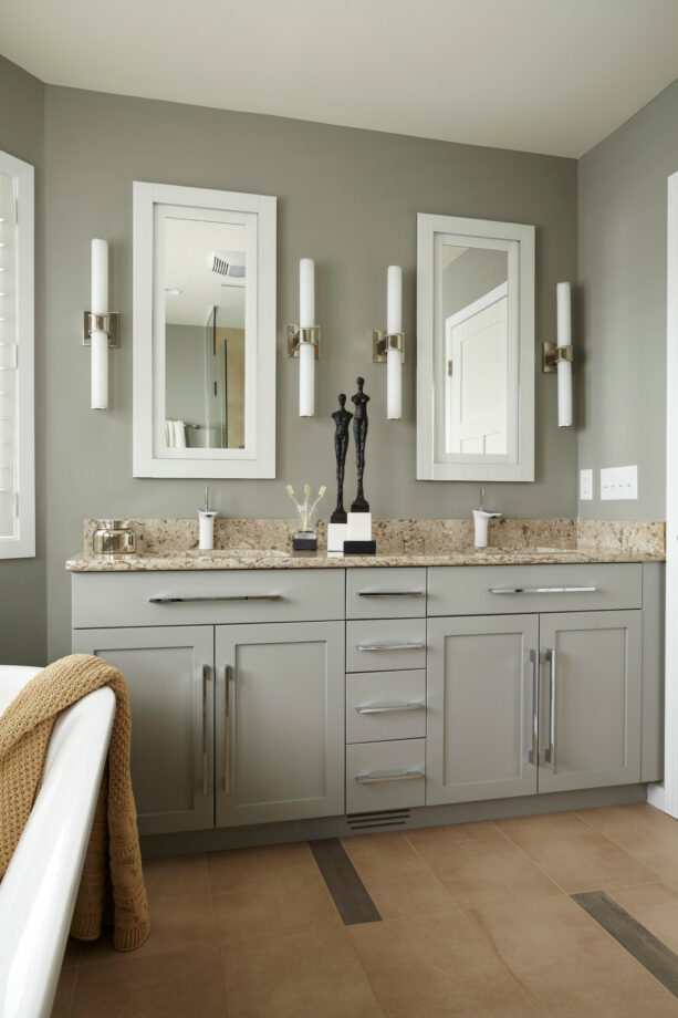
Don’t be afraid to use neutral colors together in a beige tiled bathroom if you want to achieve a modern look.
But, it’s quite tricky because traditional settings also use the same neutral color scheme. The difference is modern room is more minimalist, while the traditional design has more clutter, but in a comfortable way.
The minimalist design also requires no bold or splash of color. It usually sticks with a neutral color palette.
The walls are painted in Benjamin Moore – Sabre Gray, a regular gray that a bit contrasts the beige tile. The contrast is not only in the tile and the wall but also on the floor.
The beige tiled floor has some gray accents to match the beige-gray combo on the wall.
The Black and white combo is also incorporated here, but not too much. They only come as a decoration and the trim. The white trim looks pop against the regular gray wall, similar to the black decoration on the vanity.
The addition of black and white embodies the simplicity and minimalism in this modern bathroom.
13. Benjamin Moore – Raspberry Mousse
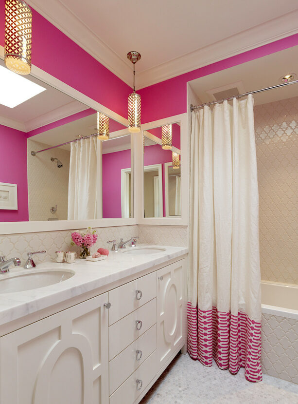
Nothing is impossible in a kid’s room.
It seems that’s the only place where you can unleash your inner child and have some fun incorporating your favorite color into the area without considering the matching game. It’s proven in this kids’ bathroom.
No one would really consider combining shocking pink walls with beige tiles. But, here they are.
The walls are painted in Benjamin Moore – Raspberry Mousse. Actually, it’s a pretty shade, a feminine one that offers a sweet and attractive look.
What about combining it with beige tile?
Well, actually, there’s nothing wrong with it, as long as you follow some “rules”.
First, choose a beige shade that’s light. It means you have to choose warm beige instead of cool. The closer it is to white, the better.
Second, you should also incorporate white. White works as a bridge to connect these clashing tones together. Make sure white is used in a large amount, dominating the room, making the pink and the beige work as an accent only.
Third, don’t directly put the shocking pink walls and the beige tile. As you see in this picture, the beige tiles are on the bath stall.
There’s a white and pink curtain over it. When it’s not in use, the curtain will close down, so the beige tiles are not visible. Plus, the beige tiles are only on the wall of the bath stall.
The ceiling is still white, so between the beige tiles and the pink walls, there’s a white ceiling to separate them.
As long as you can follow the rules the designer applies in this project, you can use the same bright pink to contrast your beige tile.
14. Valspar – Nautical
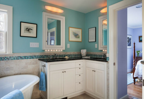
If you’re not sure whether you should use blue or green to contrast your beige tile, why don’t you use the blue-green shade?
This bathroom has blue-green walls, and it turns out that they work very well with the beige tiles.
The lower part of the walls are covered with beige tiles, while the upper parts are painted in Valspar – Nautical, the best blue-green shade you’ll surely love.
It’s not only that; the blue-green shade also appears on the beige tiles. It works as an accent, mosaic tiles that edge the tiles right above the countertops and is extended throughout the bathroom.
Using a bright shade in a beige tiled bathroom is a kind of refreshment. It will automatically force your eyes to follow it across the room.
It shows that if you have some flaws in your bathroom that you rather hide, hide them openly by incorporating such a bright and bold shade like this. It will distract people from seeing the real issues.
The Black and white combo still has to be used to make the blue-green and beige more blend-able. No need to use them too much. Just use them for the vanity.
This vanity is finished in white and has a black countertop. Putting it here is not a careless act.
Instead, a timeless vanity like this was carefully picked not just to bridge the blue and beige shade but to create a traditional setting despite the blue-green walls.
Further Tips to Decorate a Bathroom with Beige Tiles
Actually, if you’re not ready to go bold with dramatic contrast, you can always count on white, gray, and brown colored walls to be combined with beige tiles.
If you want to incorporate a beach-style look in your bathroom, or you just want to add a natural element to it, it would be best to pair your beige tiles with blue or gray.
These colors also work well with beige, apart from the fact that they resemble water and stones.
Did you know that gray and beige can be blended into one shade called greige?
This shade will deliver a subtle contrast to your beige tiled bathroom. Greige is not as popular as gray, but you can ask the painter at the store to mix gray and beige for you.
There are many ways to use a shade combination for your beige bathroom tiles.
If you want a humble and not-so-stealing combo look, you can add mosaic tiles in black, dark brown, or dark gray as an edging to your beige tiles. Or, these mosaic tiles can also work as an accent added in the center of the beige tiles to create visual interest.
To make a bold and loud contrast, you can use a shade like purple, green, or other vibrant shade painted on your wall next to the beige tiles.
A sudden change of tone like this will make your bathroom look unique. Not everyone would love it, but the ones who appreciate it would think your bathroom is one of a kind.
You can also use the floor to contrast the beige tile. Yet, the option is quite limited for the floor.
Even though basically you can pick any shade for your bathroom floor, it would be unusual if you use bright purple tile. Commonly, floor tile comes in a neutral shade.
If you want to add a Mediterranean style to your bathroom, opt for terracotta tiles.
For a safer option, you can use decorations to contrast your beige tiles.
Contrary to popular belief, if you want to make a lasting impression, never use too much loud and bold elements. Instead, tease everyone strategically around the room with just a bit of it.
In this case, you can pair beige tiles with complementing shades, like yellow or gold. But, instead of painting your walls with bright yellow or gold, you can add gold framed mirrors against your beige tiled wall or use gold hardware for the cabinets and gold faucets in the sink.
Personally, what shade and color do you think it’s best to combine with beige tiles?
What would you like your beige tiled bathroom to be?
Share your thoughts below.







Leave a Reply
View Comments