It is always a good thing to have a white house, because it means the sky is the limit when choosing accent colors.
White house siding increases the choices. There can be no match between different shades.
- Farrow & Ball – Hague Blue Shutter Color for a White Weathered Brick House
- Sherwin Williams – Attitude Gray Shutter Color for a Benjamin Moore – Ballet White House
- Benjamin Moore – Black Beauty Shutter Color for a Benjamin Moore – Brilliant White House
- Sherwin Williams – Pool Blue Shutter Color for a Benjamin Moore – Bone White House
- Valspar – Adobe Brown Shutter Color for a Valspar – Homestead Resort Jefferson White House
- Pratt & Lambert – 2294 Obsidian Shutter Color for a Benjamin Moore – White Dove House
- Sherwin Williams – Sea Salt Shutter Color for a Sherwin Williams – Pure White House
- Benjamin Moore – Black Forest Green Shutter Color for a Benjamin Moore – Atrium White House
- Benjamin Moore Moorglo – Black Shutter Color for a Benjamin Moore Brilliant White House
- Benjamin Moore – Wrought Iron Shutter Color for a Benjamin Moore – Super White House
- Sherwin Williams – Greenblack Shutter Color for a Sherwin Williams – Natural Choice White House
- Benjamin Moore – Butter Yellow Shutter Color for a Bright White House
- Benjamin Moore – Newburg Green Shutter Color for a Benjamin Moore – Brilliant White House
- Sherwin Williams – Online 7072 Soft Gray Shutter Color for a James Hardie Arctic White House
- Popular Shutter Colors for The White House
If you want to liven up a bit of white house, the best thing you can do is pick out the right shutter color.
Like the front door and trim, Shutters can complement or contrast the white siding. It is because white exterior paint is the canvas for any color you choose for the shutters.
Exterior shutters make an excellent accent on a classic white house.
Even though basically white house can go with anything, we can’t be 100% sure about the shutter color. That will be a good match for our homes.
In this post, we’ve curated some of the top color choices for shutters that look totally great on your white house.
1. Farrow & Ball – Hague Blue Shutter Color for a White Weathered Brick House
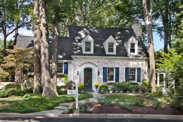
The entire color scheme in this exterior is just impressive. The black roof, white body, and green shutters as an accent.
The main idea is black and white as a backdrop, and green is a bold color to liven it up.
The shutters are painted in Farrow & Ball – Hague Blue #30 and finished in Exterior Eggshell. According to the designer, the trim was a match existing, but you may want to consider opting for Benjamin Moore – Soft Chamois #OC13.
The great thing about this house is how the bricks look white.
The homeowners stated that the brick existed. This is basically an old brick that had already been finished in white, and the new homeowners just sandblasted it when they moved in.
They had their painters lightly power wash and hand-scrap the brick to achieve this look. The result is a weathered brick like this. It is pretty obvious that the brick is treated, not painted.
2. Sherwin Williams – Attitude Gray Shutter Color for a Benjamin Moore – Ballet White House
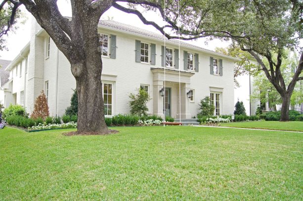
This large timeless house has a traditional exterior.
Basically, it is clear that the homeowners intend to stick with the neutral colors and prefer to use lighter shades. Thus, this exterior has no bright accent color to give a splash of fun against the all-white color scheme.
While this may be a bit boring for some, this is the common scheme for a traditional exterior.
The main exterior color is Benjamin Moore – Ballet White, the kind of crisp white you may want to color your big colonial house to make it look majestic.
The shutters are painted in Sherwin Williams – Attitude Gray. This shade can be considered the true gray, the kind of gray that’s not dark nor light. It’s just simply gray to complement the white surrounding.
If you want a simple, minimalist, yet timeless look that will last for a very long time despite the current trend, it is recommended to use this color scheme.
After all, white and gray are both neutral colors that complete each other. They never go out of style.
3. Benjamin Moore – Black Beauty Shutter Color for a Benjamin Moore – Brilliant White House
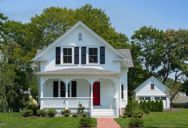
In this picture, the shutters look dark green while, in fact, it is pure black.
Black shutters are the safest option for a white house because they contrast each other but classically and dramatically.
If you want to stick with the traditional design with a classic look that exudes elegance, the black and white combination should be incorporated in your exterior paint.
And what’s the better way to apply black and white than painting the main body in white and the shutters in black?
The shutters will look pop against the white siding, and the white siding will make the house look brighter and bigger.
The shutters are painted in Benjamin Moore – Black Beauty, and the body is in Benjamin Moore – Brilliant White.
See how this mid-sized cottage looks elegant and sophisticated. Because black and white has been chosen as the main color for this exterior, the homeowners are free to experiment with the front door to add a pop of color.
The bright red front door seems to be the focal point here, making the black and white color scheme as a background for it to pop.
Unfortunately, there is no detailed information about the paint used. The front door color was matched to the homeowners’ previous door color.
4. Sherwin Williams – Pool Blue Shutter Color for a Benjamin Moore – Bone White House
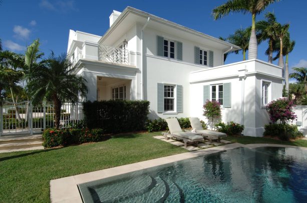
What a beautifully designed anglo Caribbean home!
The tropical white exterior is perfect for houses that are situated near the beach.
See how bright the white in this house is. It seems that there is no additional accent color, which makes the white exclusive. And the result is, this house looks even bigger and more majestic.
When it comes to the shutters, they look soft and calm, flawlessly accentuating the white body.
Actually, this is a custom powder-coated aluminum color. It is quite hard to find a similar paint color. Yet, according to the designer, his client asked to paint their shutters in Sherwin Williams – Pool Blue 6944.
The body of this house is painted in Benjamin Moore – Bone White, and the trim is in Benjamin Moore – Simply White, but the designer wasn’t so sure. The key is he made the trim starker than the bone-white.
This house shows that soft blue will never fail to complete the white body. It doesn’t create contrast but combined with white, it surely adds a soothing nuance to the exterior.
5. Valspar – Adobe Brown Shutter Color for a Valspar – Homestead Resort Jefferson White House
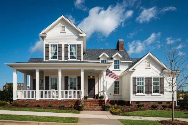
This is an ideal example of an All-American cottage. The color combination is just perfect. The designer managed to match the roof and the shutters, which is actually not an uncommon thing to do.
If you want to color-coordinate your roof and your shutters, make sure you go with a neutral color, because it would be awful if you painted your roof in a bold hue.
This roof is GAF Siena Designer Shingles in Chateau Gray color. The shutters are from a company called Southern Traditions in Greenville, SC, and they are painted in Valspar – Copper Adobe Brown 3011-9.
See how actually the shutters and the roof are in a different color. Shutters are in brown, while the roof is in gray.
However, brown and gray are both neutral colors that can complement white flawlessly. That’s why they look interchangeable. Moreover, both come in dark shades. This is a great way to color-match your roof and shutters without making them too similar.
The body of this house is painted in Valspar – Homestead Resort Jefferson White, which managed to make this house look attractive.
Instead of bright pop color, the designer accentuated this white, brown, and gray color scheme with a brick wall. Such a clever way to enhance a traditional look.
6. Pratt & Lambert – 2294 Obsidian Shutter Color for a Benjamin Moore – White Dove House
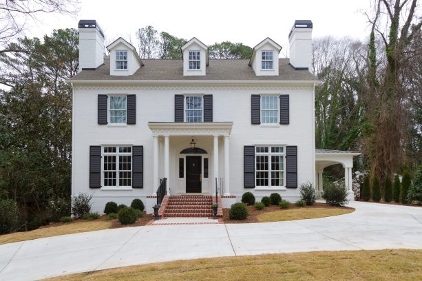
What a lovely large classic two-story house in white color.
Similar to the previous picture, the designer here also accentuated the entire look with brick. The brick front stairs look in contrast to the white exterior paint.
The body of this house is painted in Benjamin Moore – White Dove, one of the popular paint colors for white houses.
The shutters and the front door are well-coordinated here. They are both painted in Pratt & Lambert – Obsidian 2294. The shutters are made of natural wood and manufactured by Duke Shutter Company based in Acworth, Georgia.
Obsidian black and a white dove, what a dramatic contrast this exterior has. Surprising, but still simple and minimalist.
It seems that the homeowners kept the low-key attitude when choosing the roof because it was also carefully picked in a similarly neutral color. The roof is shingles by Atlas, Pinnacle Pristine, in Weathered Shadow color, which looks brown in this picture.
Every color and element in this exterior delivers a perfect traditional look, perfect for those who love a conventional appearance.
7. Sherwin Williams – Sea Salt Shutter Color for a Sherwin Williams – Pure White House
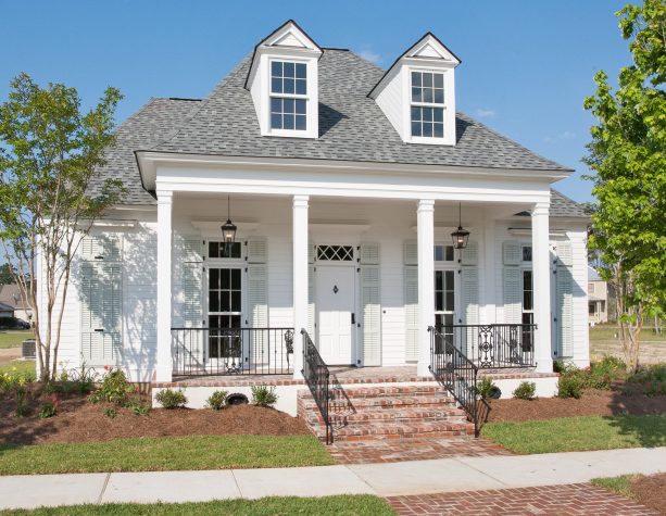
There’s something charming in this small classic wood house. It may be because the designer created this with 100% traditional elements, like the brick porch and stairs, and the neutral color scheme.
Yes, there is a pop of blue-gray color on the shutters, but the shade is pale and muted, so it can’t be really considered a splash of color.
The siding is painted in Sherwin Williams – Pure White, a traditional choice for a classic exterior.
Still by Sherwin Williams, the shutters are in Sea Salt. It is a delicate color with a combination of green, gray, and blue that dramatically changes under different lighting conditions.
The roof is in Atlas Pinnacle – Pristine Hearthstone, a nice gray color that simply completes the white siding. Another traditional exterior features a conventional color scheme.
If you want to mimic the coordination of traditional elements here, make sure that the accent color you choose is soft and muted like this.
So, even though it is basically an accent, it should not be bold, bright, or vibrant that demands much attention.
In a traditional style, white is not supposed to be a backdrop. It is the main color that should be complemented by another soft and light shade.
8. Benjamin Moore – Black Forest Green Shutter Color for a Benjamin Moore – Atrium White House
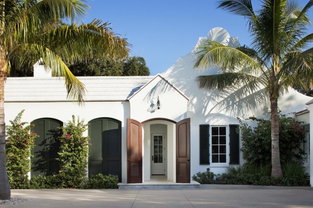
Dark green is the best alternative for shutter color if you think black is too mainstream, but you still need the classical combo of dark and light shade.
Basically, if you want dramatically contrast the white exterior paint, any dark shade but black will do. But there’s something about green that makes it impressive.
Maybe because green is a fresh and natural color, even in a dark shade like this.
If you incorporate green in your exterior, despite the shade, it will look even better if you combine it with greeneries in the front yard. They will complement each other, making your house look organic, fresh, and rejuvenating.
The shutters are painted in Benjamin Moore – Black Forest Green, the kind of dark green that looks almost black under the bright sunlight.
The body of this house is painted in Benjamin Moore – Atrium White. This is basically a stucco house, which is naturally white even without paint. But it seems that the designer intended to highlight the brightness in this exterior.
Even the roof is also white, even though it is unnoticeable from this angle. No wonder. Who can’t resist the pretty look of white after all?
9. Benjamin Moore Moorglo – Black Shutter Color for a Benjamin Moore Brilliant White House
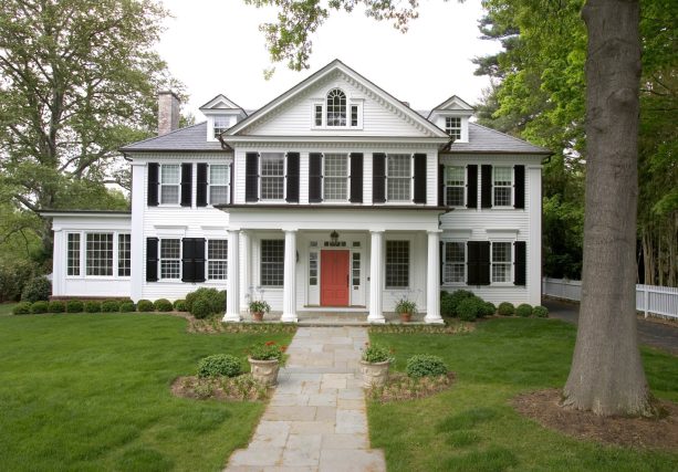
This large house looks even more grandeur due to its white exterior color.
The body is painted in Benjamin Moore – Brilliant White, similar to the trim. The shutters are painted in Benjamin Moore – Black. All of them are finished not in regular paint, but with Benjamin Moore Moorglo.
Moorglo is 100% acrylic latex house paint in a semi-gloss finish, a premium quality with alkyd resin. It gives a high-build paint film for long-lasting protection and incredible durability, perfect for exterior use.
There’s a bit of difference in the coating, though. The body is finished with Low Luster, while the trim is in Soft Gloss. Both of them deliver a different appearance, which is not noticeable under this natural light.
The gray slate roof for the main house and the copper flat roof over the porch complete the black and white color scheme.
The neutral color for the trim, body, shutters, and roof is meant to be a backdrop for the front door.
In spite of the traditional design and color combination, the designer desired to add a splash of color, even though it may go against the traditional principles of designing.
The front door is painted in coral, a kind of shade that is warm enough to accentuate the black, white, and gray color scheme, but not so bright that it hurts the eyes. What a clever way to color-coordinate a traditional exterior.
10. Benjamin Moore – Wrought Iron Shutter Color for a Benjamin Moore – Super White House
White is a common option in a traditional house, even though basically it is a timeless color.
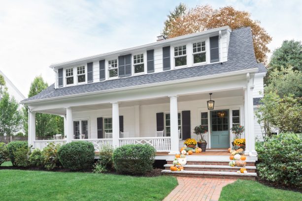
That’s why most of the houses featured here are in a traditional design. This one is no exception. This traditional house looks elegant with a shingle roof and a neutral color combination.
Similar to the previous picture, the designer here also wanted something different. He added an accent color for the front door, while the shutters and the main body are used as a background that’s not meant to attract attention.
The exterior is painted in Benjamin Moore – Super White, a typical type of white to be painted in a traditional house. The shutters are in Benjamin Moore, too, Wrought Iron.
We see from this point of view how the shutters match the roof. They are both in gray color, blending seamlessly.
On the other hand, the front door is painted in Benjamin Moore – Mountain Laurel, a soft green color that has a bit of gray in it too. It makes the front door pop, but also complements the gray shutters and roof.
If you want to stay humble with the color, pick an accent shade that has a slight touch of color on the shutters. This way, you’ll create cohesion but contrast at the same time.
11. Sherwin Williams – Greenblack Shutter Color for a Sherwin Williams – Natural Choice White House
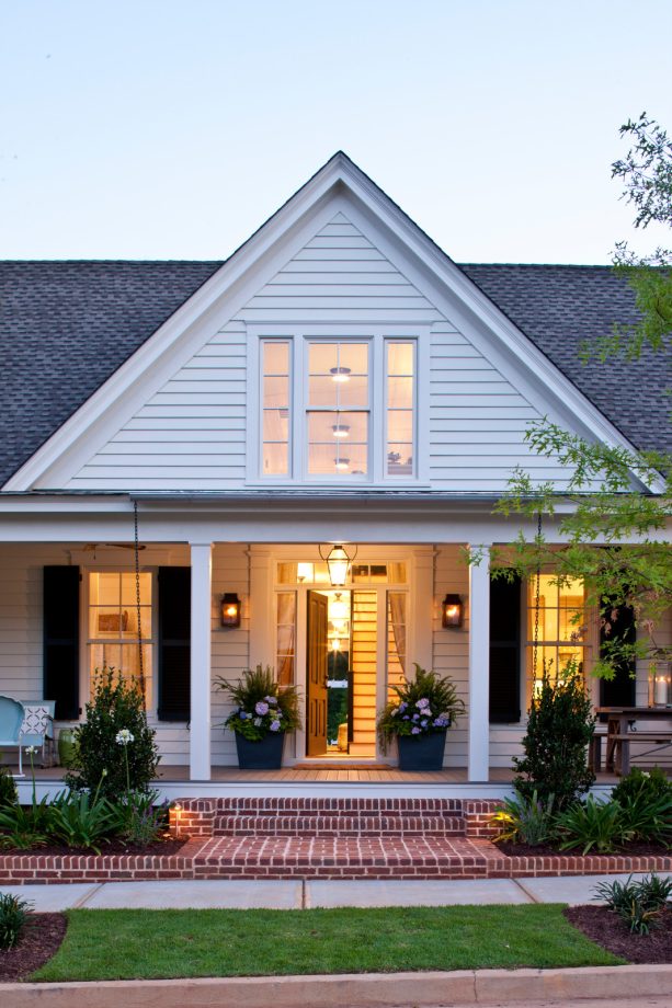
This small farmhouse features a black and white color combo for its exterior.
However, somehow it lacks the traditional style, because the design, with a big gable roof, simple columns in the porch, deck, and the brick landing + steps, represent a farmhouse style.
In spite of the farmhouse style, it seems that the homeowners wanted to stick with the neutral colors.
The body of the house is painted in Sherwin Williams – Natural Choice (SW7011), while the shutters are also by Sherwin Williams, Greenblack (SW6994). It is obvious that greenblack color in the shutters is a combination of black and green, a very dark green that looks almost black but still has a refreshing and organic look.
Under the light, the front door looks different, but it is actually painted in black. The designer attempted to match the front door and the shutters, and it turned out okay.
The black front door complements the greenblack shutters, and both contrast the white body paint.
12. Benjamin Moore – Butter Yellow Shutter Color for a Bright White House
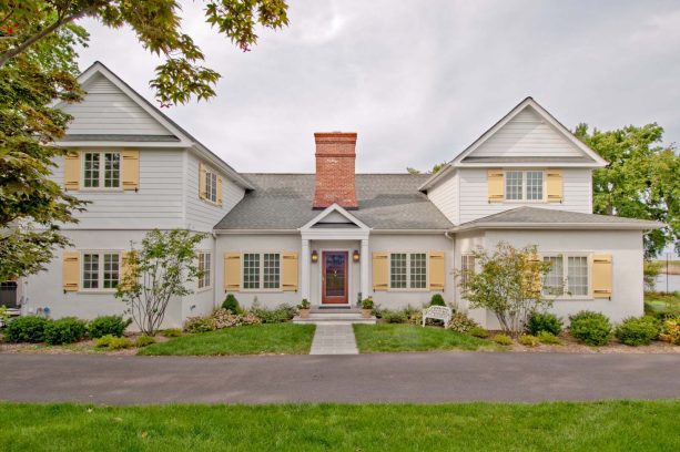
Who said that yellow couldn’t be incorporated in a traditional exterior?
In this house, you see how the designer managed to apply yellow shutters and pair them flawlessly with the bright white exterior. The soft yellow color looks pop, but at the same time, it also accentuates the white color subtly.
The shutters are painted in Benjamin Moore – Butter, a kind of yellow that is soft enough that looks as if it was melted right in your mouth, reminding you of butter, hence, the name.
You should opt for this kind of shade if you want a non-traditional color to paint your shutters, but still low-key and doesn’t attract attention.
Despite its being a bold color, the yellow shade on these shutters is not that bright and vibrant. Instead, it delivers a warm and inviting look.
The exterior itself is made of white stucco with a gable roof. The second floor has white siding. Unfortunately, there is no information about the exact paint color used. However, it seems that any simply bright white paint will do.
13. Benjamin Moore – Newburg Green Shutter Color for a Benjamin Moore – Brilliant White House
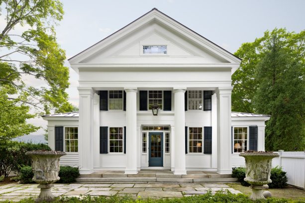
This Greek Revival house looks extravagant with its four massive columns at the front.
This house is completed with a wood gable roof and cut granite steps at the entrance. If you want to make your house look extra and appealing, white is the shade you should go for.
The body of this house is painted in Benjamin Moore – Brilliant White, which seems to be one of the most used white paint colors in white houses.
The siding and the trim are finished in Moorgard low lustre finish paint to create a polished look. The shutters are Newburg Green, a deep blue/green shade from Benjamin Moore’s historic paint collection.
The front door is also painted green, even though it appears that the green on the entrance is a bit lighter than on the shutters. From this picture, we can finally see that green can be a lovely backdrop for several shades of green.
Most of the traditional white houses in the photos above showed dark green shutters as the only shade of green. Yet, in this house, you see how the lighter green on the front door completes the entire look of the dark green/white combo.
14. Sherwin Williams – Online 7072 Soft Gray Shutter Color for a James Hardie Arctic White House
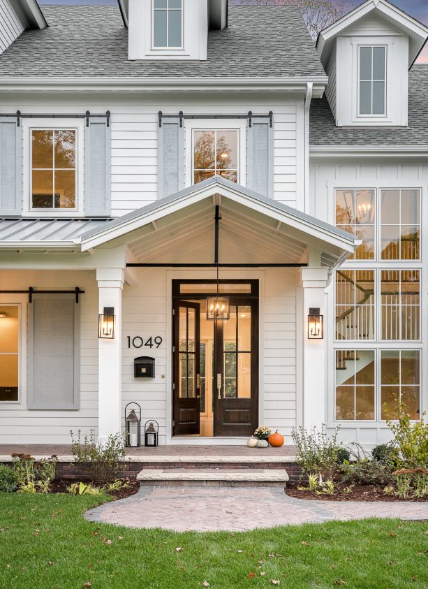
This cottage exterior looks cohesive because the designer used all the neutral colors, from black, white, to gray.
The siding is painted in James Hardie – Arctic White, a quite unique option for white houses, but it turns out that this white shade completes the farmhouse style perfectly. It also softly contrasts the grayish-black roof.
The shutters are finished in Sherwin Williams – Online 7072. It is a soft gray shade that stays humbly, clearly not meant to draw much attention.
This gray shade is supposed to create a subtle contrast to the white siding, but not too much. Instead, the great part of the window is the railing that makes it look like a barn door. The black railing seems to clash with the gray shutters, but this is a soft gray that looks almost white after all.
Double front doors are finished in polished black color to complete the whole look. These are Simpson doors and stained with Minwax Jacobean.
Instead of the shutters, the front door is the element that’s meant to be the strongest point, a thing that complements both the white siding and the gray shutters.
See how the designer managed to color-coordinate the neutral shades perfectly. Each of them is applied accordingly in the right portion.
15. Popular Shutter Colors for The White House
Despite the manufacturers and paint color names you’ve seen above, here are some popular shutter colors for white houses:
- Black. If you want to liven up your white house a bit, one of the best things you can do is to pick out the contrast color. The black color makes an excellent accent for a white house. Black shutters look classic on homes with white exterior paint because they make the crisp white of the body stand out. Black shutters on a white house also need low maintenance.
- Blue. Either your home exterior is adorned with weathered brick, white stucco, or another white building material, blue shutters can be the best option to completely transform the overall look of your home. A white house with blue shutters delivers fun and modern vibe that will draw much attention. It also makes your home look vibrant and alive. Whether it is light or dark, blue is a perfect choice to create a new look for your white house.
- Green. Do you want to give your white house an organic look? Opt for green. Green shutters are always on-trend. They also let you showcase your personality. As an earthy tone, green delivers an inviting nuance that has a wide spectrum of shades to fit your personal preference. You can choose light, dark, or something in between, and be sure that green is an excellent accent for a white house.
- Red. Even though there is no red shutter in the picture you’ve seen above, that doesn’t mean that red can’t be an option. It is a fun and vibrant color. Burnt red is an excellent option if you want to achieve a rustic look, while bright reds can be more fun to work with white houses. Red shutters need some upkeep, though, so if you don’t mind taking care of them to make sure the red stays true, go for it.
- Brown. Any shade of brown can work well on white houses. If you go with dark brown, it can appear black unless it is highlighted in the right light. If you want to accentuate your white house with a brown accent, consider choosing a lighter shade. Despite the hue you choose, brown is a safe option, a neutral color that looks great.
- Gray. This is a color that ties black and white together. Dark gray shutters can be your perfect option if you don’t want to dramatically contrast your white house, but still want to create an odd look against it. On the other hand, light gray can complement white perfectly because, after all, there’s a touch of white in gray.


Leave a Reply
View Comments