Having an open concept kitchen has been a popular choice for the last decade. Many homeowners with a more traditional kitchen layout even decided to knock down walls to open up their homes.
The most combined areas in the house to apply this open-plan design are kitchens and living rooms.
- Dark Grey Trendy Kitchen and Silver Contemporary Living Room Combo
- U-Shaped Kitchen with Transitional Living Room Combo in Medium Tone Wood Floor
- White Trendy Kitchen with Industrial Living Room Combo
- Mountain Style Kitchen with Rustic Living Room Combo
- Combo Contemporary Kitchen and Urban Style Living Room with White Walls
- Brown Classic Kitchen with Beige Traditional Living Room Combo
- Transitional Kitchen and Modern Living Room Combo with White Walls
- Stainless Steel Modern Kitchen and Grey Contemporary Living Room Combo
- Modern Farmhouse Kitchen and Bright Vintage Living Room Combo
- Elegant Beige Wall Kitchen and Cozy Modern Living Room Combo
- Country Style Kitchen and Mountain Style Living Room Combo
- Crisp White Small Peninsula Kitchen and Classic Living Room Combo
- Two Levels of Eat Kitchen and Mid-sized Modern Living Room Combo
- Black and White Pullman Kitchen and Beige Transitional Living Room Combo
- Narrow L-shaped Kitchen and Off-White Rustic Living Room Combo
- Large Open Transitional Kitchen and Country Style Living Room Combo
- Tips to Decorate Kitchen and Living Room Combo
The remodeling trend of combining kitchens and living rooms started to gain popularity in the early ’90s.
The combination of kitchens and living rooms is called a “great” room. A great room is usually one central room that incorporates the comfortable living space and kitchen and dining area.
There are several benefits of having a kitchen living room combo:
- creating a brighter and bigger room. If you have a small room, combining your kitchen and living room is an excellent choice. Your room will become brighter, bigger, and more spacious. Removing partitions between kitchens and living rooms makes the room seem pleasant and expensive too.
- gathering all family members. A living room is basically the center place where all family members spend their free time. However, recently people seem to love spending their time in kitchens too. So, why not combine them into one area? This is a perfect idea if you have a growing or big family.
- providing easier access to other rooms. When combining kitchens and living rooms, you have easier access to the spaces around, like a dining room, a backyard, or bedrooms.
- easier to clean. Compared to a partitioned room, an open space is obviously easier to clean. It is because there are not many corners, cleaning and tidying up the room would be faster.
- more accessible furniture arrangement. When you have an open plan room, you’ll have more freedom in selecting and arranging the furniture. This would be even more perfect if you prefer a minimalist style because it can make the room look fresher and more considerable.
If you have made up your mind to open up your kitchen, here are some refined pictures of the kitchen and living room combo to get inspiration from:
1. Dark Grey Trendy Kitchen and Silver Contemporary Living Room Combo
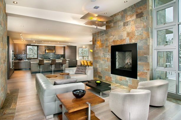
A trendy kitchen like this always gives an excellent first impression. It delivers a chic, stylish, and ultra-modern look.
This trendy kitchen’s chicest and elegant element is the dark grey cabinets, island, and appliance. Combined with the multicolored backsplash, they basically radiate a masculine look. However, the ceiling lights soften the whole look.
The living room, on the other hand, has a nice contemporary look. The key feature here is a suspension light made from glass, metal, and silver leaf. It is meant to counter the bold black fireplace. It gives a subtle touch of dramatic sense in this abstract-shaped living room.
High storefront windows deliver a nice view outside, and they let the coming light reflected through the silver planes here.
The light wood floor also enhances the look, both for the contemporary living room and the kitchen, because light wood like this usually gives an ultra-modern look, despite its being a natural element. The gray walls blend harmoniously with the floor, creating a perfect earthy tone.
2. U-Shaped Kitchen with Transitional Living Room Combo in Medium Tone Wood Floor
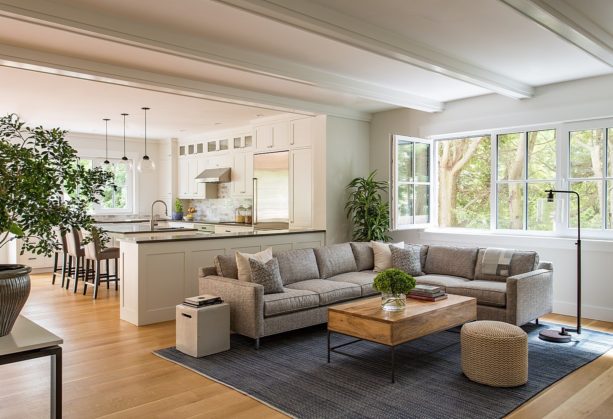
All-white is a must color palette if you want to achieve a traditional style yet clean, fresh, and cozy.
The kitchen looks lovely with its U-shaped layout and an island in the center. The white cabinets and island is completed with dark brown countertops. Dark brown and white complement each other.
The dark brown here also serves as an accent color in order to avoid the kitchen from being too pale. Additionally, the floor is wood in a medium tone. This medium tone wood mixes well with the accent color too.
The wide windows along the wall make the room look even brighter and fresher. The hanging glass pendants above the island also add to the illumination of the room.
There is a cabinet with a meal prep zone counter that is meant to be a divider between the kitchen and the living room.
Place against the cabinet; there is a grey comfy sectional. This is a transitional living room, where the traditional meshes with the modern cohesively.
The traditional element can be seen in the unfinished wood coffee table, where the modern elements are in the wide windows, white walls, and the decorative standing lamp.
3. White Trendy Kitchen with Industrial Living Room Combo
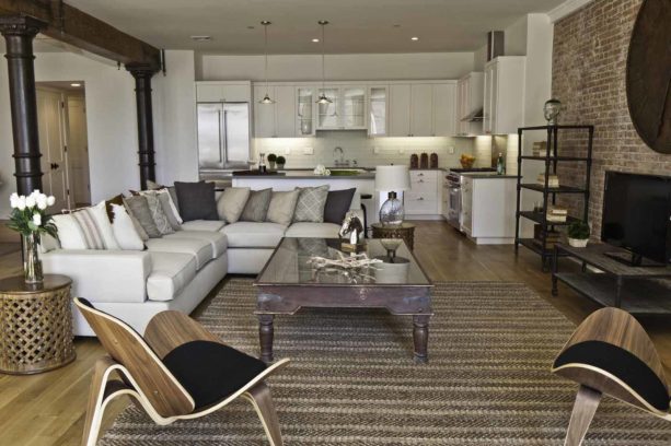
White is often used as the critical element of trendy modern decor. It is because, as a neutral color, white can never be wrong. It can also be used as a perfect color background that can be paired with any additional color. But if you don’t like any pop of color, white is your best bet. That is why the designer and the homeowners decided to use white for this trendy kitchen.
Everything in this kitchen looks polished and crisp.
Instead of a pop of color, in order to avoid being too pale, this kitchen is added with a glass-front cabinet, dark countertops, and stainless steel appliances. It seems that the hanging pendants above the island were also made from metal, an additional element to this all-white kitchen.
The living room is quite different. Even though the living room and the kitchen share the same flooring and have no real boundary, the transition between the kitchen and the living room can be easily sensed.
The living room looks more colorful, even though it was still filled with muted colors and earthy tones.
The industrial decoration can be seen from the exposed unfinished brick wall.
The weathered table and the pipelines rack also give a sense of industrial style. All of them are combined with the off-white sectional completed with neutral-colored throw pillows. The unique-shaped chairs complement the whole look.
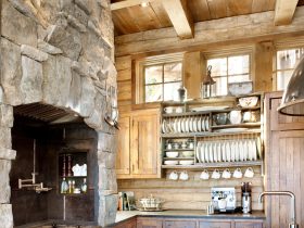
4. Mountain Style Kitchen with Rustic Living Room Combo
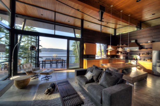
From the first glance, we can already conclude that the kitchen here is in mountain decoration style.
There are several shades of wood added here. In fact, this kitchen is dominated by a wood element. The cabinets are in medium tonewood, while the backsplash is made from dark wood horizontal slabs reaching up the ceiling.
In the center of this kitchen, there is a set of weathered wood breakfast tables completed with the benches. Instead of counter stools, this kitchen is equipped with a “real” dining space with a more comfortable seating area.
Above the breakfast table, there are three decorative hanging pendants that radiate artificial lighting, in addition to the natural light coming from the small square-shaped window.
The living room is in rustic style. Instead of natural elements, we can see several custom-made furniture pieces.
The black couch looks lovely combined with the dark table in front of it. The couch area is covered with a gray carpet, adding a more comfortable look to this area. There are window walls around and double sliding glass doors leading to the porch to make sure this room is illuminated well by natural light.
Basically, this open concept area is a result of a delicate balance of custom amenities and natural materials. They both fill the interior spaces with breathtaking views of the lake from almost every angle.
5. Combo Contemporary Kitchen and Urban Style Living Room with White Walls
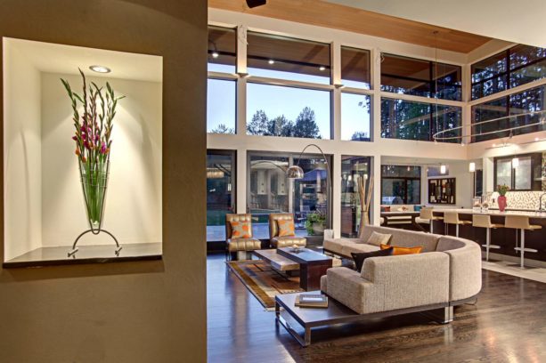
This contemporary kitchen looks bright, fresh, and spacious. It is completed with a high wooden ceiling and huge picture windows right below the ceiling and other smaller glass windows in the wall around. Those windows let the right amount of natural light pour into the room.
The designer added a set of stylish hanging pendants above the dark island despite the natural light. It doesn’t only give enough artificial light to the room, but it also serves as a chic decoration.
There are four trendy low-back counter stools, indicating that this kitchen is also a place for an eating-in.
Back to back with the counter stools, there is an elegant sectional in grey color. This sectional serves as a distinction between the kitchen and the living room.
There is no “real” boundary between these two areas. Both use white walls and white oak with a clear satin coat and espresso color wood flooring.
The living room also has tall windows. However, the windows in the living room are floor to ceiling, letting more natural light come into the room.
Urban style living room combines industrial, modern, and contemporary elements, and this living room has them all. The industrial elements here are more like a modern industrial. They can be seen from the wooden coffee table and the wooden floor.
The modern style comes from the shiny metallic chairs and standing lamp, while the tall windows give a sense of contemporary in this room.
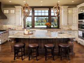
6. Brown Classic Kitchen with Beige Traditional Living Room Combo
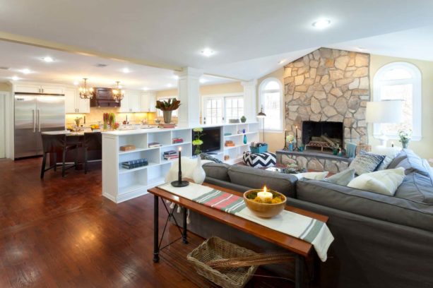
The classic kitchen is equipped with a structural half wall with custom shelving. It is a perfect combination of function and design.
The classic and traditional elements from this kitchen come from the white french doors matching with the white glass panel windows. They are meant to add natural light to this room.
There is also a large island that delivers a lot of seating for the family as well as an extra prep space.
Traditional lines represent the custom cabinetry which accommodates all of the kitchen’s appliances. On top of that, there are two elegant classic chandeliers above the large island that emit warm yellow lights around the room.
Between the kitchen and the living room, there is a low white bookcase as a boundary. This bookcase is used as an entertainment space for the living room because there is a TV in it too.
The living room is also in traditional style, even though it also adds a sense of modern style from the cozy grey sectional. It is piled with throws and pillows, delivers plenty of seating to gather around the TV.
The traditional element in this living room is the hardwood floor and the fireplace. The stone fireplace is bracketed by arched windows, and that is the main focal point of the room. Opposite the fireplace, there is a bar perfect for entertaining.
7. Transitional Kitchen and Modern Living Room Combo with White Walls
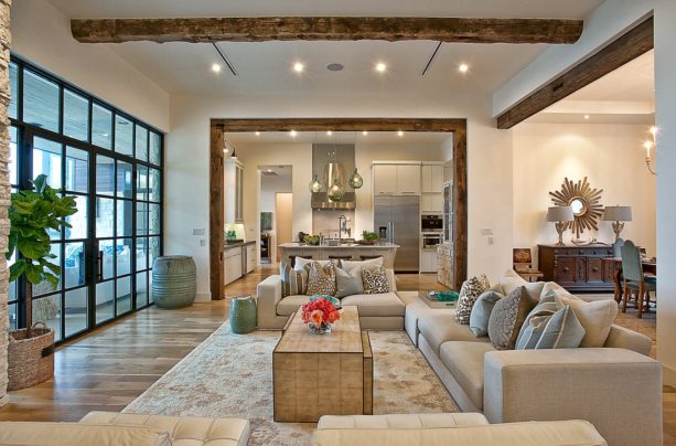
Between this modern-looking open concept area, there is a half wall separated both, but only in the edges.
The design of this area is uniquely multifaceted. Basically, the overall floor plan design focuses on maximizing the views. There is also extensive glazing carefully placed to frame and enhance the views.
The transitional style in the kitchen is easily seen. It is a combination of contemporary and clean elements but with a touch of antique charm.
The white flat panel cabinets combined with stainless steel appliances and marble countertops give a modern look, while the light tone wood floor and dark wood stools give a more contemporary style.
The living room is basically also modern with its polished walls around and clean spaces. However, there is also a rustic touch from the wooden frame around the opening and in the ceiling.
The beige sofa, couch, and upholstered chairs, along with the earthy tone throws, deliver the modern look too. They are strategically placed opposite the double glass panel doors that open up to the outdoor area.
8. Stainless Steel Modern Kitchen and Grey Contemporary Living Room Combo
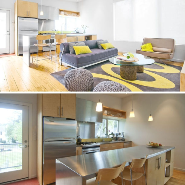
A modern kitchen like this is indeed perfect when combined with stainless steel because there is nothing that speaks modernism louder than shiny elements. The stainless steel in this kitchen is not only in the appliances but also in the countertops and the backsplash.
The stainless steel is also completed with light wood cabinets and the floor. Its combination perfectly radiates a modern look because it delivers a clean and fresh look. In order to give sufficient lighting, there is a glass door allowing natural light to come in.
The living room is more contemporary because it has a splash of color. Instead of combining two neutral elements, this living room is more playful. The couches are in gray and light brown, while the ottomans are in gray color too.
In order to avoid being too pale, there is a yellow accent color added to the carpet and then in the throw pillows. This pop of color really brightens up the room, making it look warmer.
9. Modern Farmhouse Kitchen and Bright Vintage Living Room Combo
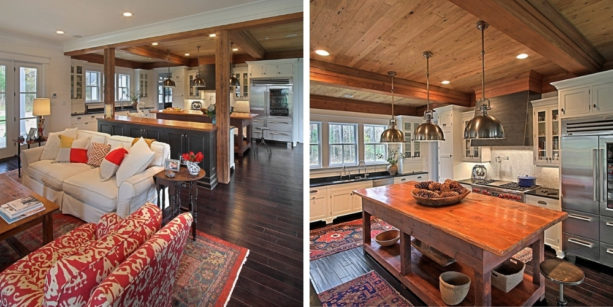
This kitchen is not like the usual farmhouse style. In fact, it also has a modern touch. The modern elements in this farmhouse kitchen are the metal hanging pendants, stainless steel appliances, and white walls. Those are usually used in contemporary design.
On the contrary, there is a large wood table that is used as an island. There are wood kitchen utensils stored below the table too. Those can be used as decorations too.
The dark wood floor, the wood ceiling, along the vintage red carpet are the elements of a farmhouse decor style. The combination of modern and farmhouse style gives a unique yet warm ambiance.
The living room also has a vintage style, thanks to its classic red rug. The red patterned couch on top of the patterned rug gives a perfect pattern block style. They give a splash of color in the combination of dark wood and white color.
10. Elegant Beige Wall Kitchen and Cozy Modern Living Room Combo
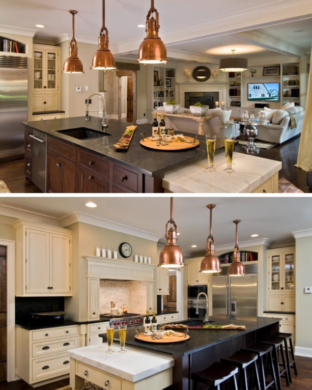
Beige walls never fail to give an elegant look to a room. It is because beige means being flexible, conservative, and dependable. Beige is relaxing, calm, and neutral.
Having beige walls in your kitchen will not only enhance the elegance in the room but also gives a soothing sensation.
The designer of this kitchen managed to marry beige walls with a dark polished wood island along with similar bar stools. The countertops are also in dark color. The combination of beige and black makes this area even more stylish in its own way.
As an accent, in order to avoid being too monochromatic, the bronze metal pendants were added along with stainless steel appliances.
The living room opposite the kitchen also shares the same neutral color, even though the living room is more of an off-white color. There is no physical boundary between the kitchen and the living room. There is only a subtle color transition from beige to off-white.
The living room is in abstract shape, which makes it even more unique. The sofa and couch were strategically placed in front of the corner fireplace and the media wall.
The layout, as well as the white color in this room, delivers the modern style, which looks nice when juxtaposed with the elegant beige walls kitchen.
11. Country Style Kitchen and Mountain Style Living Room Combo
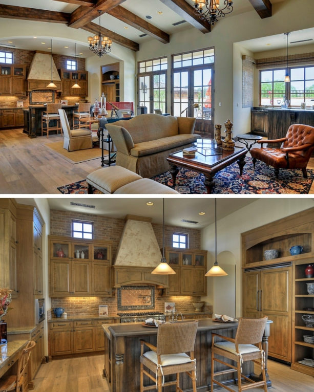
Country-style decor represents a cozy and casual decorating style, eluding to the feeling of simple country life. This kitchen is the same. The materials used to create a country-style decor usually includes stone, brick, wood, and other natural materials.
This kitchen features wooden cabinetry, a wood island, a wood floor, and a brick backsplash. The cabinets here are made out of Alder wood with a lighter finish, which is meant to let the wood grain come through.
The flooring is, DuChateau, engineered pre-finished wood in Antique White color from The Chateau Collection. The brick backsplash is called Robinson Thin Brick in Ironworks color.
All of them are perfectly balanced with the Dunn Edwards – Marble Dust wall paint color.
The boundary between the kitchen and the living room is a dining table set. It is bracketed between the kitchen and the living room. The living room shares a similar floor; however, it looks more like a mountain style.
Mountain-style rooms typically have wooden ceiling beams and hardwood floors. In-country style, the elements used are weathered wood, antique artifacts, or tin accessories. While in mountain-style rooms, there is a wide range of color combinations.
This living room features wooden ceiling beams, which start from the dining area. In the kitchen, on the other hand, the ceiling is simply white equipped with ceiling lights. In the living room, there are vintage-looking chandeliers that give a mountain-style look too.
The color combination range here is also wider. The multicolored rug perfectly complements the wood floor, and it matches flawlessly with the dark red chair.
12. Crisp White Small Peninsula Kitchen and Classic Living Room Combo
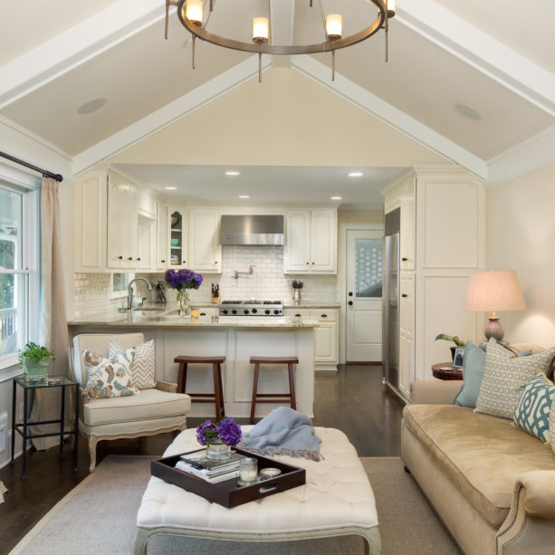
This peninsula kitchen looks perfectly polished and crisp due to its all-white design. Instead of looking too plain and boring, this kitchen looks clear, fresh, and trendy. It is because the designer managed to mix several finishes together.
The glossy white subway tile backsplash looks super fine combined with matte-looking cabinets and peninsula. They are all in white colors, but in different finishes.
That is the smart way to decorate a small kitchen, especially when combined with sufficient lighting. It is because white and light will give an impression of a spacious room.
We can see here that this kitchen, even though it doesn’t feature any window, but is completed with several ceiling lights to illuminate the whole area.
The peninsula, completed with the bar stools for a dining space, serves as a boundary between the kitchen and the living room.
The living room looks a bit “brighter” with some splashes of color here and there. However, the basic color is still white, making it a perfect example of a classic living room.
To brighten up the room, there is a gold-colored couch piled with green patterned throw pillows. Those are meant as accent colors that also blend with the dark wood floor.
Unlike the kitchen, we can see here that there is a window letting fresh air and natural light coming into the room, giving a clean and fresh vibe.
13. Two Levels of Eat Kitchen and Mid-sized Modern Living Room Combo
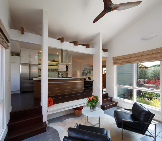
There’s something unique in this open-plan room. Even though basically they are connected because there is no solid partition here, both the kitchen and the living rooms are separated from each other.
The kitchen is located in a more elevated area. To access the kitchen from the living room, the owners need to ascend some wooden steps.
There are two pairs of wooden steps located on each side of the room. In the central area, the focal point in this open room, there is a white opening in square-shaped completed with a cushion, which is meant to be a bench as extra seating space.
The kitchen itself is completed with a large wood island in the center. There is no barstool there because the dining space is separated from the meal prep zone. We can see here that the dining area is on the left side of the kitchen.
The combination of white and wood elements gives a perfect contemporary look. To top it off, the Tilvera glass backsplash from Ceramic Tile Center completes the whole look.
The living room looks more modern. It has white walls around it and a white ceramic tile floor. The leather brass lounge chairs, along with the small round coffee table and white rug, clearly have the elements of a modern style.
The wood ceiling fan also has a modern look, and somehow, it flawlessly matches the dark wood color and kitchen island.
14. Black and White Pullman Kitchen and Beige Transitional Living Room Combo
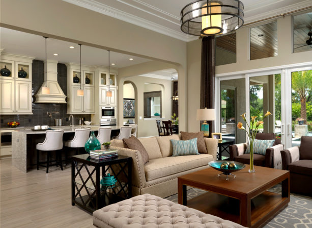
This lovely combination of kitchen and living room highlights the transitional style, especially the living room.
The nailhead and traditional skirted sofas are nicely combined with a clean-lined cocktail table. It gives a formal look too, especially it is also mixed with beige walls.
We all know that beige gives a sense of comfort, relaxing, and secured feeling, making it a perfect background tone that can be paired with anything.
The kitchen looks more elegant. The decor is a simple combination of black and white. It features a Pullman layout, which is basically an L-shaped design but with an island in the center. This layout is perfect for a narrow kitchen like this.
The white cabinetry is combined with the black backsplash reaching up the ceiling. The dark island, along with the gray countertop, looks flawless mixed with the white upholstered bar stools and dark frames.
Both kitchen and the living room have a glazed porcelain floor. It has the same look with a vein cut travertine but with a muted striae style.
There is no solid partition between the kitchen and the living room, but it has a wide opening with half a wall from the ceiling separated these two rooms.
15. Narrow L-shaped Kitchen and Off-White Rustic Living Room Combo
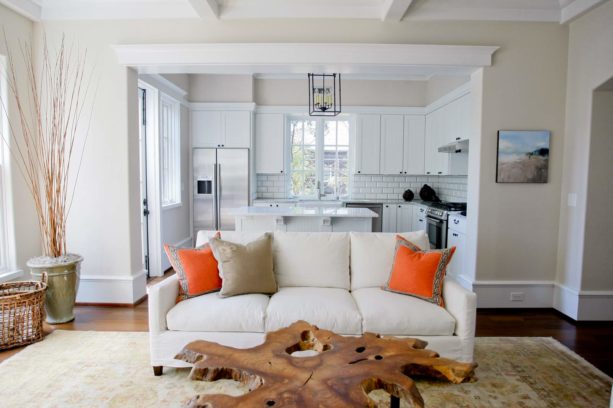
To decor a narrow kitchen, the best layout would be an L-shaped kitchen, or also known as a Pullman kitchen. For the meal prep area, there is an island placed in the center of the kitchen.
This kitchen features an all-white color scheme too. White is known as a color you should choose for a small room to make it look bigger.
The designer managed to turn a narrow kitchen into something that looks bigger than it actually is. Besides the all-white decor, there are double windows over the sink that let the natural light in.
As an accent color, the designer added a black metal hanging pendant as the main artificial light. It is also combined with stainless steel appliances to balance the white decor.
The living room is also mainly decorated in white color, but the white here is more brownish. It is known as off-white color. This off-white living room features a rustic style.
The rustic elements can be found in the coffee table made out of a slice from a tree trunk with a metal base, the rattan basket, and the wood floor. To complement the clean lines and colors of this living room, the off-white slipcovered furniture was added.
The combination of white/off-white here becomes a clear distinction between the kitchen and the living room. There is no solid partition here. Instead, there is a large opening in a square shape in the living room that opens to the kitchen. That’s where the color subtly transitions.
16. Large Open Transitional Kitchen and Country Style Living Room Combo
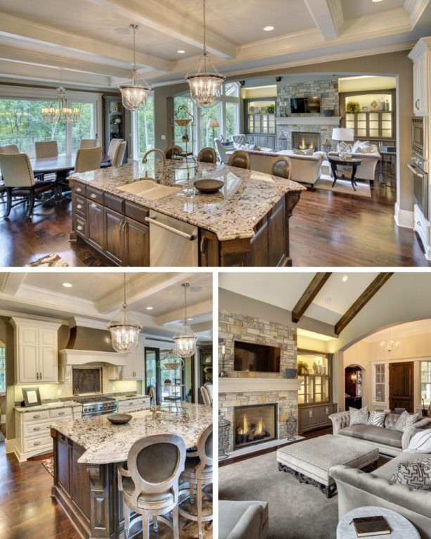
This large kitchen has an open layout that has no boundary whatsoever. The furniture arrangement clearly differentiates the kitchen and the living room.
The kitchen here has an elegant transitional style. Painted in Benjamin Moore – Briarwood, the wall blends seamlessly with the white cabinetry, which was painted in China White color.
The antique fireback backsplash with a shield design delivers a vintage look; when combined with a modern style, it becomes a transitional style.
The island is made out of walnut; it is completed with a Branco Antico granite countertop. The lovely countertops blend with both the island and the cabinets.
There are four counter stools here. It means that the island can also be used as a dining space. However, on the right side of the kitchen, there is a round breakfast table completed with tall back chairs. It serves as an extra seating area, perfect for a family gathering.
The unique part of this kitchen is the area behind the cooktop or Butler’s pantry. The homeowners call it the resource room. It is meant for storage, sink, beverage refrigerator, and ice maker on both sides of the room.
Except for the large opening in the kitchen that opens to the living room (and vice versa), there is no boundary between the kitchen and the living room.
The living room here, on the contrary, is in country style. It can be seen from the exposed beams in the ceiling. The fireplace is also surrounded by stone, which is a natural element that is one of the key characteristics of country-style decor. The stone is Colter Pass.
The sofa, couch, the upholstered ottoman, and the chairs are in similar grey color. They share the same color with the rug too.
The cabinets on both sides of the fireplace are also in gray color. It seems that the gray color in this living room delivers a warm yet elegant look, but the wood floor and beams give the coziness of a country style.
17. Tips to Decorate Kitchen and Living Room Combo
After choosing the best decoration style and the layout from the pictures above, the next step is to design the room. However, it might be challenging to make the combo look easier flowing and spacious, arrange the color combinations and set the clear separation of the living room and kitchen areas.
If you are having those difficulties, too, here are some quick guides to decorate your perfect combo:
- Choose a color palette. The important thing in an interior design is selecting the right color combination. The color palette of your kitchen should emphasize the living room. In order to make the living room more striking, use brighter colors. On the contrary, use subtle colors for the kitchen. You can also use a bright color for the kitchen if you like but use the subdued tone instead. It delivers a smooth transition. However, your main goal is the make the living room the focal point.
- Use the rugs. If you have difficulties separating the areas, you can divide the spaces visually by using rugs. You can use the same rugs for the living room and the kitchen, or choose the more eye-catching one for your living room. Just make sure not to choose too bright and patterned rugs to avoid visual clutter.
- Light up the room. Abundant light never fails to give an impression of a more spacious and broader room. That’s why you need to make sure the natural light from the windows and the artificial lighting are balanced. Leave the space in front of your windows and place the furniture rightly to let the light in. When it comes to artificial lights, a modern ceiling lamp or a chandelier is sufficient to illuminate the room.
- Use an aesthetic room divider. After eliminating the physical barrier between your kitchen and living room, adding a room divider might sound wrong. However, it delivers an intriguing and chic look. Make sure you choose the aesthetic ones, like simple wooden bars or low bookcases.
- Go all-white. If you can’t decide the right color combination for the combo, the never-fail option is all-white. You can combine different shades of cream and white. Combine it with wooden tones to give an impression of more open and fresher space. If it looks too pale, add colorful art pieces or use colorful bar stools to the island.



Leave a Reply
View Comments